This is our second session introducing Shiny, an R package that allows to develop interactive Apps in a familiar framework for regular R-users. During the first session we focused on the structure and workflow basics, and now, we will go further on input and output objects, reactivity, layouts and data handling.
All these functionalities will be reviewed by product of developing a Shiny App. It will provide the grades to our students and, at the same time, they will be able to explore the data set by interacting with the App. In addition to show static information, we will incorporate some reactive features conditional to the user, we will add the possibility of loading data and we will arrange all this in a friendly interface.
We will need RStudio with R (>= 3.0.2) and the package below. It is also highly recommended to have a look at our first post about An Introduction to Shiny as a Teaching Resource.
install.packages("shiny", dependencies = TRUE)
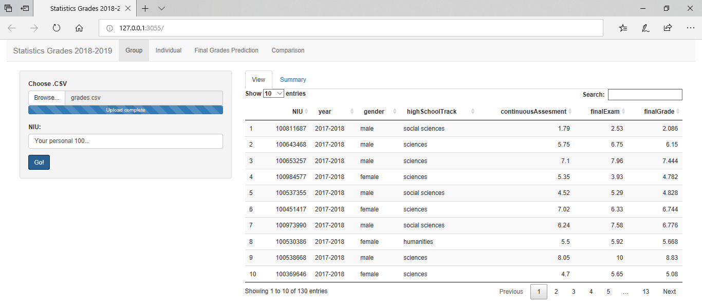
The Student’s Grades Data Set
A relevant task in teaching duties is the continuous and final assessment. Typically, we communicate this information via a static documents such as PDFs, spreadsheets or using the institutional platform (Aula Global).
From my point of view and as former professor of Statistics, it is an excellent moment to put into practice the contents of the subject. At this moment, students are excited (worried) about the results and probably, for the first time, they will pay attention to us. Maybe they are looking forward to know for example,
- Personal marks and global marks as well.
- How they perform with respect to others.
- The expected mark in the final exam given his/her own continuous assessment (regression).
- If there is any difference by some characteristics…
The following link contains a folder with the final App and the data sets we are going to use along the session.
The data set contains information about students from the last year, 2017-2018 course, and the current 2018-2019 course. In addition to some categorical varibles such as gender, high school track or Identification Number (NIU), it provides the continuous assessment and the final exam grades.
grades <- read_csv("grades.csv")
DT::datatable(grades)
Notice that for the students of 2018-2019 we do not have the final exams grades since they have not done it yet.
The next part is just a proposal of analysis of the data set above. Any suggestions?
Descriptive Statistics
Firstly, we could add some summary statistics just by,
#Numerical variables
summary(grades$continuousAssessment)
##    Min. 1st Qu.  Median    Mean 3rd Qu.    Max.
##   1.530   4.930   6.470   6.212   7.380  10.000
#Categorical variables
table(grades$gender)
##
## female   male
##     85    100
In addition, we could provide the ranking of a given student by,
id <- 1
NIU <- grades$NIU[id]
rank <- which(sort(grades$continuousAssessment, decreasing = TRUE, index = TRUE)$ix == id)
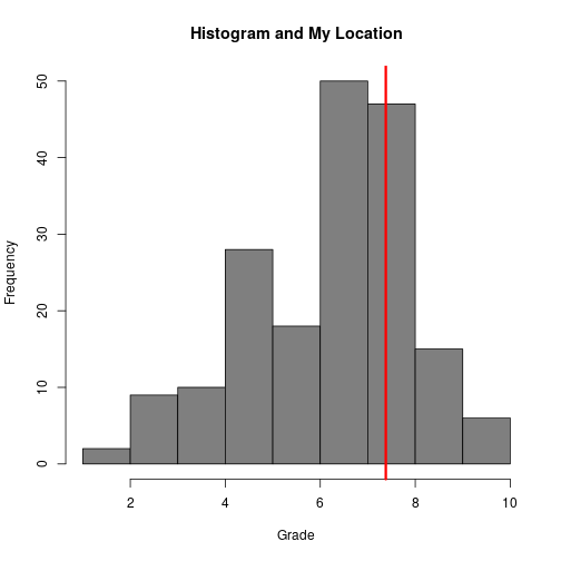
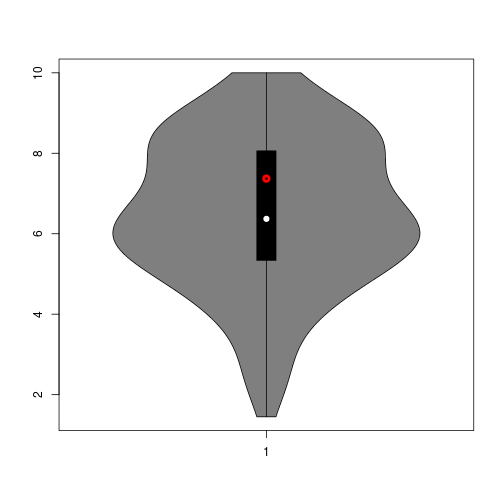
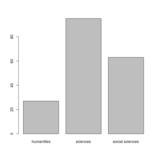
Secondly, we would like to include histograms, violin plots and bar plots. For a given user, we could also include his/her location on the plots.
hist(grades$continuousAssessment, xlab='Grade', main = 'Histogram and My Location', col='grey50')
abline(v = grades$continuousAssessment[which(grades$NIU==NIU)], lwd=3, col ='red')
vioplot(grades$finalExam[!is.na(grades$finalExam)], col='grey50')
points(1, grades$finalExam[which(grades$NIU==NIU)], col ='red', lwd = 4)
barplot(table(grades$highSchoolTrack))
Regression
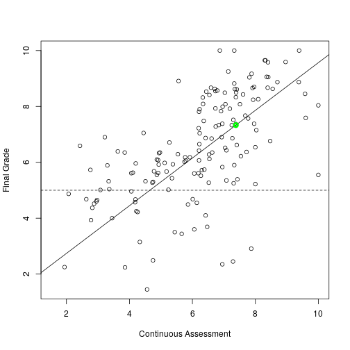
One could think about predicting the final grade of the former students given the continuous assessment. In this case, given one NIU we would like to provide the expected final grade.
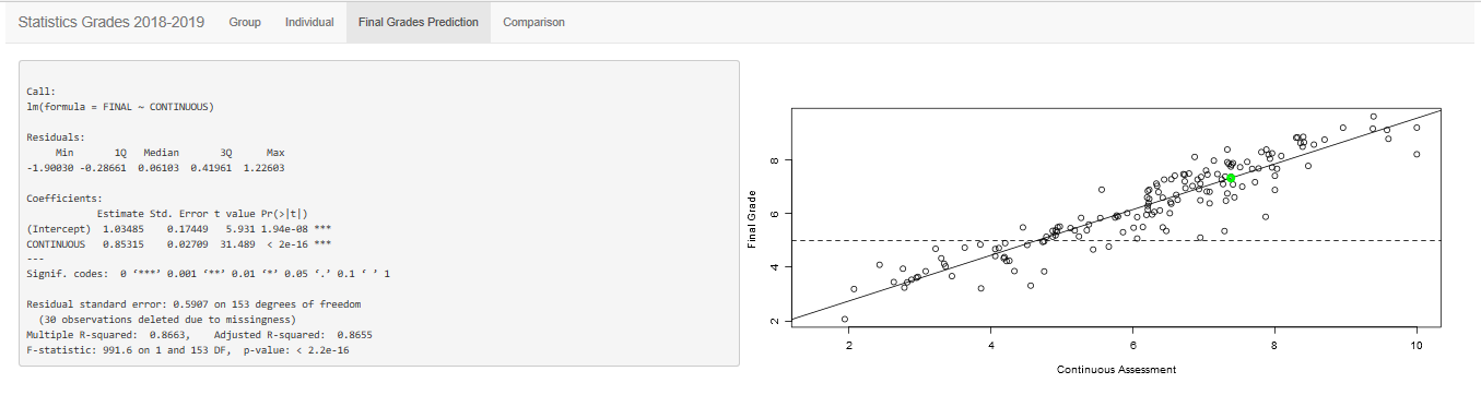
linealModel <- lm(grades$finalGrade ~ grades$continuousAssessment)
summary(linealModel)
##
## Call:
## lm(formula = grades$finalGrade ~ grades$continuousAssessment)
##
## Residuals:
##      Min       1Q   Median       3Q      Max
## -1.90030 -0.28661  0.06103  0.41961  1.22603
##
## Coefficients:
##                             Estimate Std. Error t value Pr(>|t|)
## (Intercept)                  1.03485    0.17449   5.931 1.94e-08 ***
## grades$continuousAssessment  0.85315    0.02709  31.489  < 2e-16 ***
## ---
## Signif. codes:  0 '***' 0.001 '**' 0.01 '*' 0.05 '.' 0.1 ' ' 1
##
## Residual standard error: 0.5907 on 153 degrees of freedom
##   (30 observations deleted due to missingness)
## Multiple R-squared:  0.8663,	Adjusted R-squared:  0.8655
## F-statistic: 991.6 on 1 and 153 DF,  p-value: < 2.2e-16
prediction <- predict(linealModel, grades$continuousAssessment[which(grades$NIU==NIU)])
if(prediction[which(grades$NIU==NIU)]<5){idcol <- 'red'}else{idcol <- 'green'}

plot(grades$continuousAssessment, grades$finalExam, ylab = 'Final Grade', xlab = 'Continuous Assessment')
abline(linealModel)
abline(h = 5, lty = 2)
points(grades$continuousAssessment[which(grades$NIU==NIU)], prediction[which(grades$NIU==NIU)], col=idcol , lwd=4)
Central Limit Theorem and Resampling
Typically, the last sessions of a basic Statistics course are devoted to the Central Limit Theorem, Confidence Interval and Hypothesis Testing. This part of the App will try to illustrate that the sample mean is a random variable and that we cannot compare sample means for testing if there are significant differences.
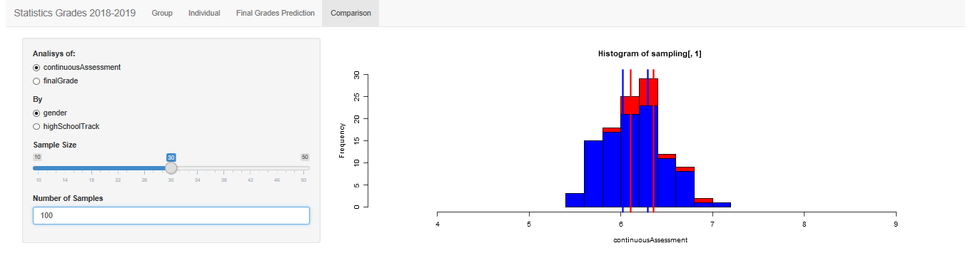
The following code estimates empirically the distribution of the mean for a given characteristics. Then, we can visualize how far is one empirical distribution from the other. Below it is ton for testing if there is a difference in continuous assessment between males and females. As default it takes $100$ samples of size $30$ but it would be illustrative to leave them as inputs of our App.
replicates=100
sample = 30

sampling <- matrix(NA, nrow=100, ncol=2)
for(i in c(1:replicates)){
  sampling[i,1] <- mean(grades$continuousAssessment[sample(which(grades$gender=='male'), sample)])
  sampling[i,2] <- mean(grades$continuousAssessment[sample(which(grades$gender=='female'), sample)])
}

hist(sampling[,1], ylim=c(0,30), xlim=c(4,7), col='red', xlab = 'Grade')
hist(sampling[,2], col='blue', add = TRUE)

abline(v = c(mean(sampling[,1])-2*sd(sampling[,1])/sqrt(sample),mean(sampling[,1])+2*sd(sampling[,1])/sqrt(sample)), col='red', lwd=3)
abline(v = c(mean(sampling[,2])-2*sd(sampling[,2])/sqrt(sample),mean(sampling[,2])+2*sd(sampling[,2])/sqrt(sample)), col='blue', lwd=3)
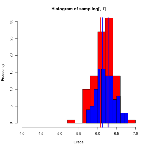
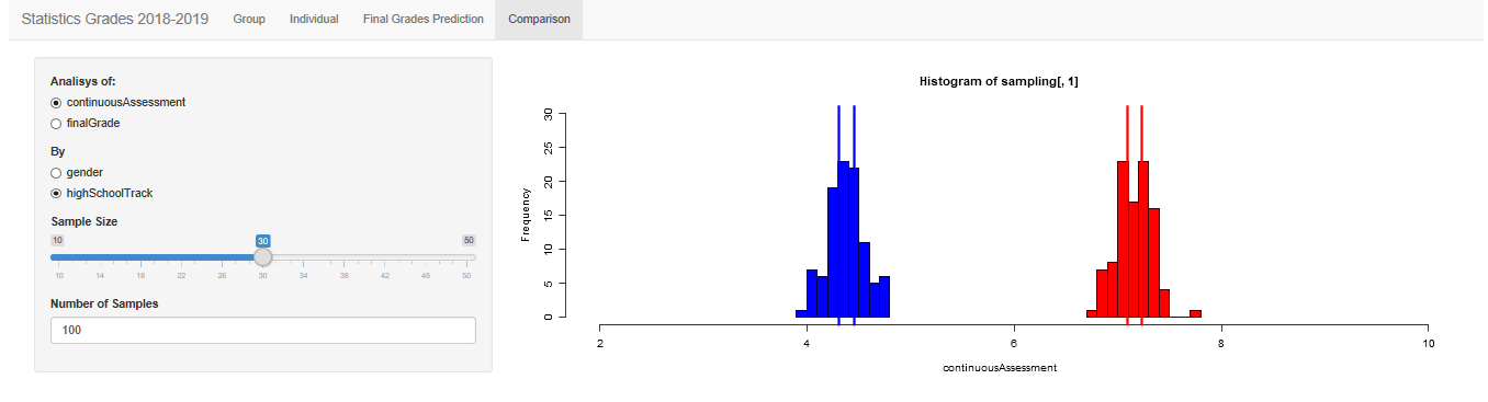
We could think also about differences between students from a science track or from no science tracks,
replicates <- 100; sample <- 30
sampling <- matrix(NA, nrow=100, ncol=2)
for(i in c(1:replicates)){
  sampling[i,1] <- mean(grades$continuousAssessment[sample(which(grades$highSchoolTrack=='sciences'), sample)])
  sampling[i,2] <- mean(grades$continuousAssessment[sample(which(grades$highSchoolTrack!='sciences'), sample)])
}

hist(sampling[,1], ylim=c(0,30), xlim=c(2,8), col='red', xlab = 'Grade')
hist(sampling[,2], col='blue', add = TRUE)

abline(v = c(mean(sampling[,1])-2*sd(sampling[,1])/sqrt(sample),mean(sampling[,1])+2*sd(sampling[,1])/sqrt(sample)), col='red', lwd=3)
abline(v = c(mean(sampling[,2])-2*sd(sampling[,2])/sqrt(sample),mean(sampling[,2])+2*sd(sampling[,2])/sqrt(sample)), col='blue', lwd=3)
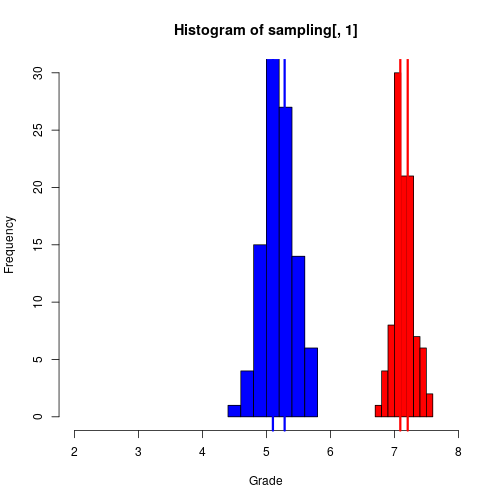
We have plotted the sample distribution of the mean by the categorical variable. As we commented before, it would be interesting if the student could tune the number of samples and the sample size for a visualization of the CLT.
Baselines Developing Our Shiny App
This section contains the first steps for building our App. For more details, the reader could check An Introduction to Shiny.
Any single Shiny App must have the following parts:
ui(User Interface) - nested R functions that assemble an HTML user interface for the App. It is in charge of the contents and style of the App,server- a function with instructions on how to build and rebuild the R objects displayed in the UI. Its arguments are the inputs and the outputs of the App. In this part is where our R code is going to be included.shinyApp- combinesuiandserverinto an App.
As it was shown in our last post about Shiny, just one single R script could contain the whole application. The skeleton of this one-file-Shiny-App would be,
library('shiny')

ui <- fluidPage(content1, content2,...)

server <- function(input, output){}

shinyApp(ui = ui, server = server)

# or even more simplified

shinyApp(ui = fluidPage(content1, content2,...), server = function(input, output){})
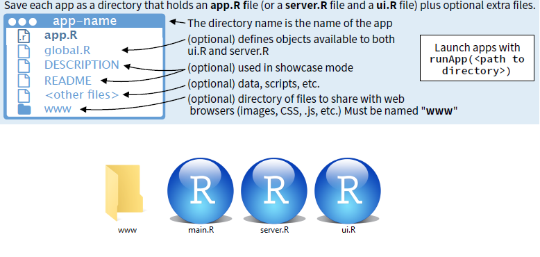
However, when the App becomes more complicated and we want to add more functionalities the R script above could become hard to manage. Fortunately, if desired, one could create a folder for holding the App and split the code. As mandatory files, it must have two .R files named ui.R and server.R. We will also create the main.R for running the App by runApp(path), being path the location of our folder. However, if we set our folder as working directory, R-Studio recognizes the App.
From R code to a Shiny App
One reasonable way of building a Shiny App is starting from the R code that the App will requires. Then we must start thinking about Inputs and Output objetcs, in other words, what we need from the user and what we want to show to the user. At the Introduction we wrote some R script with some ideas about the results we would like to show to the student. In this section, we will go little by little adding it to a Shiny App and including reactivity.
Reactivity is what makes Shiny App special and one of the most complex issues while developing. Master this feature will allow to do more sophisticated Apps, however, just some intuitions and insights could improve a lot our developing skills. For a more detailed information, I refer to the reader to this talk from 2016 Shiny Developers Conference.
Data handling
First things first, we have to load the data set. Assuming that the file is at the server (our App folder in this case), we could read it by adding to the server.R our favorite command for loading data. Here we will use the function read_csv() from the package readr. The command library(readr) can be added at the beginning of the main.R file.
fluidPage(

)

function(input, output) {

  grades <- read_csv("grades.csv")

}
Typically, for each subject we have two or three small groups and it would be desirable to add an option for choosing the file of the group to which the student belongs to. This option implicates our first reactive action, the user has to take a decision and our App has to take into account this action when loading the data. Then, we will have to include an Input Object at ui.R and a reactive function at the server.R. The function switch() is useful for assigning an action to different choices.
fluidPage(
  selectInput(inputId = "dataset",
              label = "Choose a dataset:",
              choices = c("G61", "G62"))
)

function(input, output) {
    grades <- reactive({
    switch(input$dataset,
           "G61" = read_csv("gradesG61.csv"),
           "G62" = read_csv("gradesG62.csv"))
  })
}
Another option that we could consider it is to provide to the App the ability of uploading a file from a local directory. For doing this, we can use the fileInput() at the ui.R for gathering the file directory. Then, this can be used at the server.R.
fluidPage(
  fileInput('file', 'Choose .CSV', accept = "text/csv",  placeholder = "No file selected"),
  actionButton('go', "Go")
  # submitButton("Submit")
)

function(input, output) {

  #grades <- eventReactive(input$go,
  grades <- reactive({
    read.csv(input$file$datapath)
  })

}
Both options above work. However, if we do not add the trigger, the App will try to read a .csv from a location that has not been provided.
Printing Data
The simplest choice would be to print the dataset with a table.
fluidPage(
  tableOutput('data')
)

function(input, output) {

  grades <- reactive({
    read_csv('grades.csv')
    })


  output$data <- renderTable({
    grades()
    #head(grades())
  })

}
We could print just the information of one student that provides his/her NIU (student identification number). For that, it would be needed an input object for the NIU.
fluidPage(
  textInput('NIU', "NIU"),
  tableOutput('data')
)

function(input, output) {

  grades <- reactive({
    read_csv('grades.csv')
    })

  output$data <- renderTable({
    grades()[grades()$NIU==input$NIU,]
  })

}
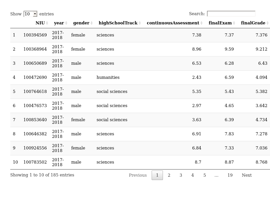
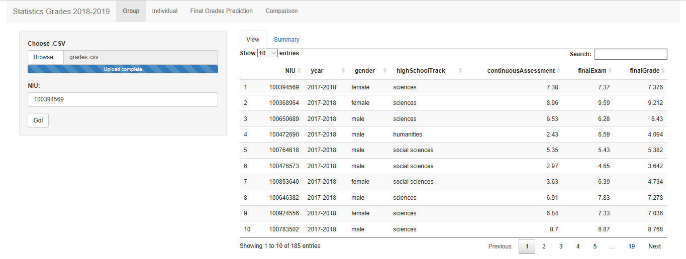
But we could also use a function that embedded JavaScript code providing an interactive table from the package DT (add library(‘DT’) at main.R). This table allows for filtering, searching values, etc.
fluidPage(
  DT::dataTableOutput('grades')
)

function(input, output) {

  grades <- reactive({
    read_csv('grades.csv')
    })

  output$grades <- DT::renderDataTable({
     grades()
     })
}
Group Tab
Below we propose a code for summarizing continuousAssessment and HighSchoolTrack by a plot and some statistics.
fluidPage(
  sliderInput(inputId = "bins",
              label = "Number of bins:",
              min = 1,
              max = 50,
              value = 30),
  verbatimTextOutput('summary'),
  plotOutput(outputId = "histogram"),
  plotOutput(outputId = "barplot")
)

function(input, output) {

  grades <- reactive({
    read_csv('grades.csv')
    })

  output$summary <- renderPrint({
    summary(grades())
  })

  output$histogram <- renderPlot({
    hist(grades()$continuousAssessment, breaks = input$bins)
  })

  output$barplot <- renderPlot({
    barplot(table(grades()$highSchoolTrack))
  })
}
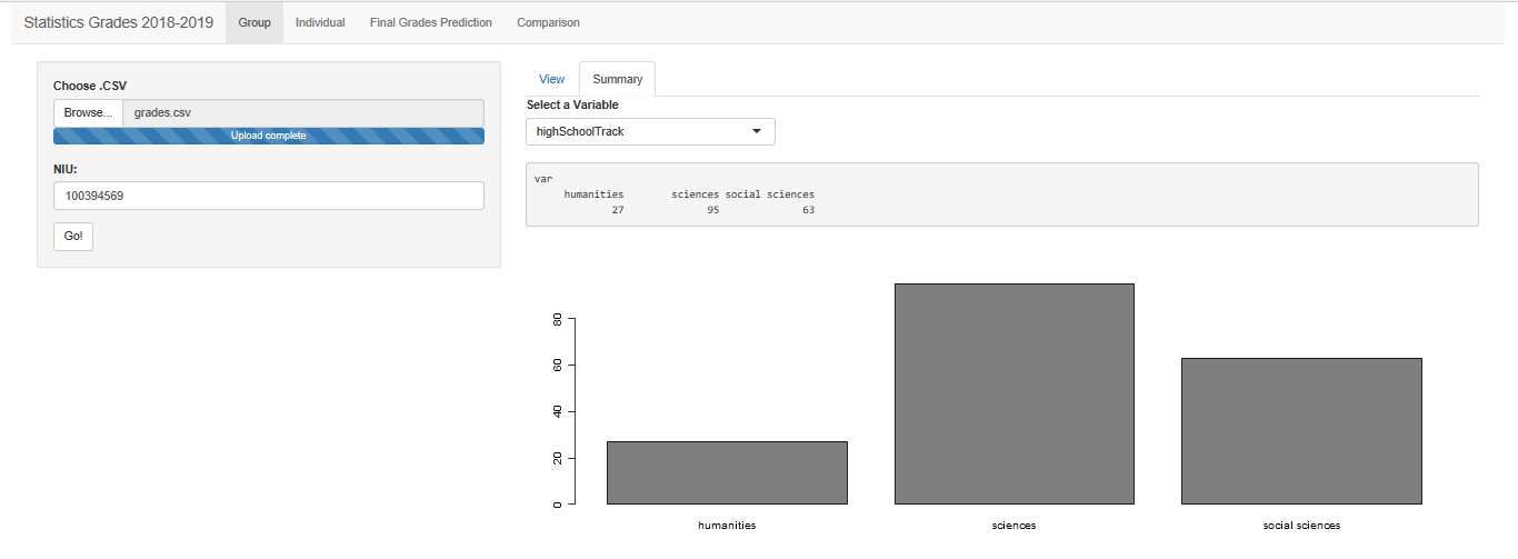
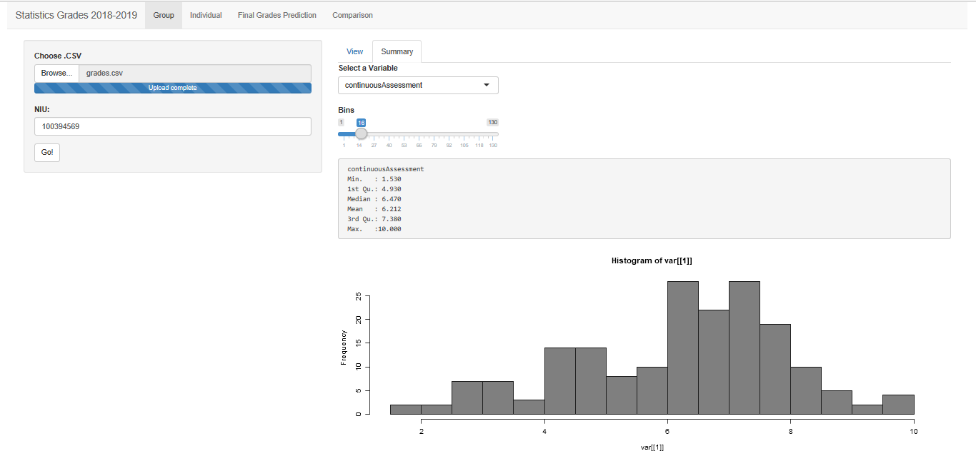
If we allow to the user to select one variable, we have to control whether the variable is categorical or numerical. For categorial variables, we will display a frequency table and a bar plot. For a continuous variable, we will show a summary and an histogram. For doing this, we will use the functions renderUI() and uiOutput().
library('shiny')
library('DT')
library('readr')

ui <- fluidPage(
  fileInput('file', 'Choose .CSV', accept = "text/csv",  placeholder = "No file selected"),
  textInput("NIU", "NIU:", "100..."),
  actionButton("go", "Go!"),
  DT::dataTableOutput('grades'),
  uiOutput('variables'),
  verbatimTextOutput('summaryGroup'),
  plotOutput(outputId = "plotGroup")
)

render <- function(input, output) {
  grades <- eventReactive(input$go, {
    read_csv(input$file$datapath)
  })

  output$grades <- DT::renderDataTable({
    grades()
  })

  output$variables <- renderUI({
    selectInput('variables', 'Select a Variable', choices = as.character(colnames(grades()[,2:dim(grades())[2]])), selected = 'continuousAssessment')
  })

  output$summaryGroup <- renderPrint({
    var <- grades()[,input$variables]
    if(is.character(var[[1]])){
      table(var)
    }else{
      summary(var)
    }
  })

  output$plotGroup <- renderPlot({
    var <- grades()[,input$variables]
    if(is.character(var[[1]])){
      barplot(table(var), col='grey50')
    }else{
      barplot(table(var), col='grey50')
      hist(var[[1]], col='grey50')
    }
  })


}

shinyApp(ui = ui, render)
Headache is.character(var) -> good to know, Tibbles VS DataFrames !
In addition, if the variable is continuous and a histogram is plotted, we would like to tune the number of bins.
library('shiny')
library('DT')
library('readr')

ui <- fluidPage(
  fileInput('file', 'Choose .CSV', accept = "text/csv",  placeholder = "No file selected"),
  textInput("NIU", "NIU:", "100..."),
  actionButton("go", "Go!"),
  DT::dataTableOutput('grades'),
  uiOutput('variables'),
  uiOutput('ifBins'),
  verbatimTextOutput('summaryGroup'),
  plotOutput(outputId = "plotGroup")
)

render <- function(input, output) {
  grades <- eventReactive(input$go, {
    read_csv(input$file$datapath)
  })

  output$grades <- DT::renderDataTable({
    grades()
  })

  output$variables <- renderUI({
    selectInput('variables', 'Select a Variable', choices = as.character(colnames(grades()[,2:dim(grades())[2]])), selected = 'continuousAssessment')
  })

  output$ifBins <- renderUI({
    var <- grades()[,input$variables]
    if(is.character(var[[1]])){
      return()
    }else{
      sliderInput("bins", "Bins",
                  min = 1, max = 130, value = 10)
    }
  })

  output$summaryGroup <- renderPrint({
    var <- grades()[,input$variables]
    if(is.character(var[[1]])){
      table(var)
    }else{
      summary(var)
    }
  })

  output$plotGroup <- renderPlot({
    var <- grades()[,input$variables]
    if(is.character(var[[1]])){
      barplot(table(var), col='grey50')
    }else{
      barplot(table(var), col='grey50')
      hist(var[[1]], col='grey50', breaks = input$bins)
    }
  })


}

shinyApp(ui = ui, render)
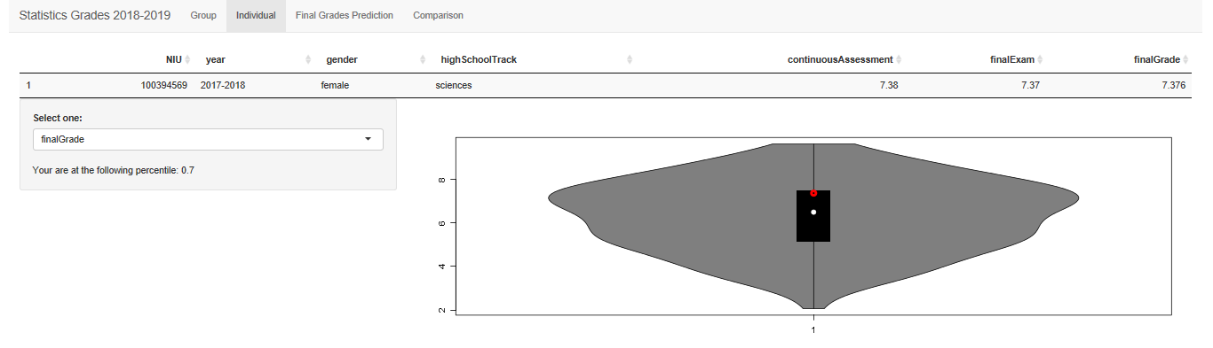
Personal Tab
Given a NIU, we will show the personal grades as well as some location statistics with respect to the class grades.
library('shiny')
library('DT')
library('readr')
library('vioplot')

ui = fluidPage(
  fileInput('file', 'Choose .CSV', accept = "text/csv",  placeholder = "No file selected"),
  textInput("NIU", "NIU:", "100..."),
  actionButton("go", "Go!"),
  DT::dataTableOutput('gradesIndividual'),
  selectInput('varIndividual', 'Select one:', choices =c('continuousAssessment', 'finalExam', 'finalGrade')),
  textOutput('ranking'),
  plotOutput("plotIndividual")
)


render = function(input, output) {
  grades <- eventReactive(input$go, {
    read_csv(input$file$datapath)
  })

  output$gradesIndividual <- DT::renderDataTable({
    DT::datatable(grades()[grades()[,1]==input$NIU,], options = list(dom = 't'))
  })

  output$ranking <- renderText({
    id <- which(grades()[,1] == input$NIU)
    var <- data.matrix(na.omit(grades()[,input$varIndividual]))

    p <- round(1-which(sort(var, decreasing = TRUE, index = TRUE)$ix == id)/length(var), digits=2)
    paste('Your are at the following percentile:', p, sep=' ')
  })

  output$plotIndividual <- renderPlot({
    var <- na.omit(grades()[,input$varIndividual])
    vioplot(var[[1]], col='grey50')
    if(!is.na(var[[1]][which(grades()[,1]==input$NIU)])){
      points(1, var[[1]][which(grades()[,1]==input$NIU)], col ='red', lwd = 4)
    }
  })
}

shinyApp(ui = ui, render)
Final Grades Prediction Tab
Here we just consider to predict the final grade given the continuous assessment. However, the regression model is defined as a reactive value and, therefore, the code below could be easily extended for more general cases.
library('shiny')
library('DT')
library('readr')
library('vioplot')

ui = fluidPage(
  fileInput('file', 'Choose .CSV', accept = "text/csv",  placeholder = "No file selected"),
  textInput("NIU", "NIU:", "100..."),
  actionButton("go", "Go!"),
  verbatimTextOutput('summaryLM'),
  plotOutput('plotLM')
  )

render = function(input, output) {
  grades <- eventReactive(input$go, {
    read_csv(input$file$datapath)
  })

  linealModel <- reactive({
    FINAL <- data.matrix(grades()[,7])
    CONTINUOUS <- data.matrix(grades()[,5])
    lm( FINAL ~ CONTINUOUS)
  })

  output$summaryLM <- renderPrint({
    summary(linealModel())
  })

  output$plotLM <- renderPlot({
    FINAL <- data.matrix(grades()[,7])
    CONTINUOUS <- data.matrix(grades()[,5])

    prediction <- predict(linealModel(), CONTINUOUS[which(data.matrix(grades()[,1]) == input$NIU)])
    if(prediction[which(grades()[,1] == input$NIU)]<5){idcol <- 'red'}else{idcol <- 'green'}

    plot(CONTINUOUS, FINAL, ylab = 'Final Grade', xlab = 'Continuous Assessment')
    abline(linealModel())
    abline(h = 5, lty = 2)
    points(CONTINUOUS[which(data.matrix(grades()[,1])==input$NIU)], prediction[which(data.matrix(grades()[,1]) == input$NIU)], col=idcol , lwd=4)
  })
}


shinyApp(ui = ui, render)
Comparison Tab
library('shiny')
library('DT')
library('readr')
library('vioplot')

ui = fluidPage(
  fileInput('file', 'Choose .CSV', accept = "text/csv",  placeholder = "No file selected"),
  textInput("NIU", "NIU:", "100..."),
  actionButton("go", "Go!"),
  radioButtons('varInterest', 'Analisys of:', choices =c('continuousAssessment', 'finalGrade'), selected = 'continuousAssessment'),
  radioButtons('categorical', 'By', choices =c('gender', 'highSchoolTrack'), selected = 'gender'),
  sliderInput('samplesize', 'Sample Size', min = 10, max = 50, value =30),
  numericInput('realizations', 'Number of Samples', value = 50),
  plotOutput('plotComparison')
)

render = function(input, output) {
  grades <- eventReactive(input$go, {
    read_csv(input$file$datapath)
  })

  output$plotComparison <- renderPlot({
    replicates <- input$realizations
    samplesize <- input$samplesize

    varClass <- na.omit(grades()[!is.na(grades()[,input$varInterest]),input$categorical])
    var <- data.matrix(na.omit(grades()[,input$varInterest]))
    classes <- unique(varClass)

    sampling <- matrix(NA, nrow=replicates, ncol=2)
    for(i in c(1:replicates)){
      sampling[i,1] <- mean(var[sample(which(varClass == classes[[1]][1]), samplesize, replace=TRUE)])
      sampling[i,2] <- mean(var[sample(which(varClass == classes[[1]][2]), samplesize, replace=TRUE)])
    }

    hist(sampling[,1], ylim=c(0,30), xlim=c(min(c(sampling))-2,max(c(sampling))+2), col='red', xlab = as.character(input$varInterest))
    hist(sampling[,2], col='blue', add = TRUE)
    abline(v = c(mean(sampling[,1])-2*sd(sampling[,1])/sqrt(samplesize),mean(sampling[,1])+2*sd(sampling[,1])/sqrt(samplesize)), col='red', lwd=3)
    abline(v = c(mean(sampling[,2])-2*sd(sampling[,2])/sqrt(samplesize),mean(sampling[,2])+2*sd(sampling[,2])/sqrt(samplesize)), col='blue', lwd=3)

  })
}


shinyApp(ui = ui, render)
Layout and themes
Here comes the part related to tidy up our outputs in a nice interface and framework. I propose the following design and we will see how to incorporate these sections in our ui.R.
There is a wide list of choices and they can be combined as desired.
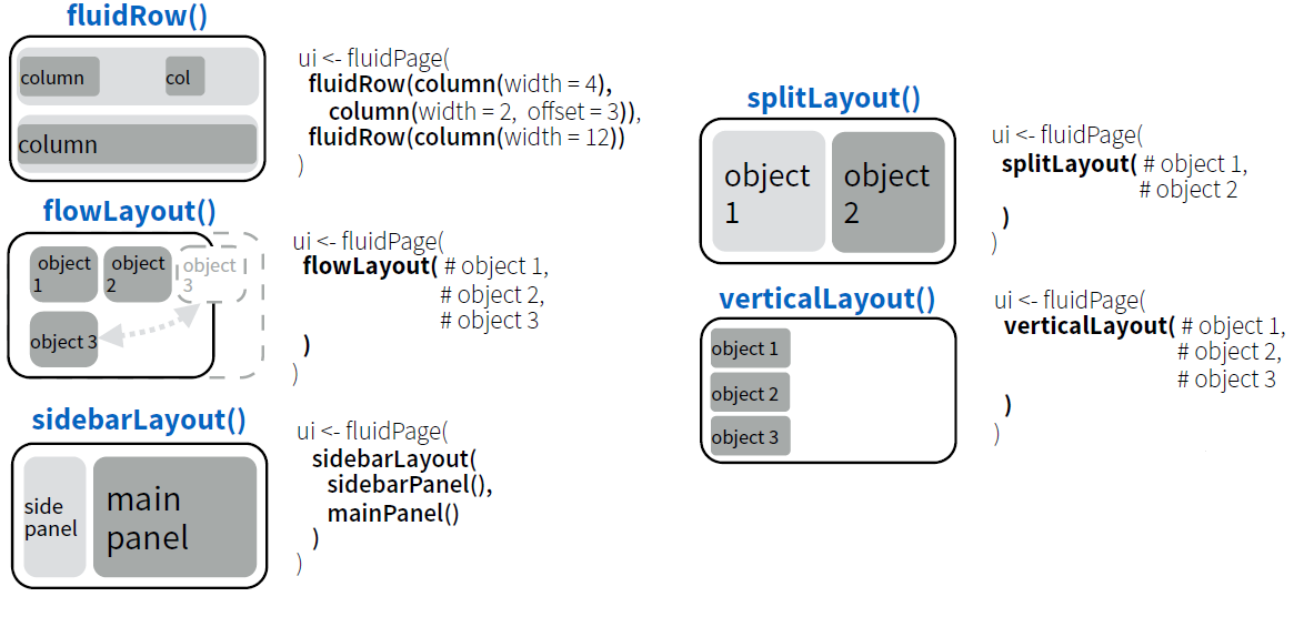
The following code provides the main layout structure where outputs have to be added.
fluidPage(
  navbarPage(
    # theme = "cerulean",  # <--- To use a theme, uncomment this
    "Statistics Grades 2018-2019",
    tabPanel("Group",
             sidebarPanel(
             ),
             mainPanel(
             )
    ),
    tabPanel("Individual",
             verticalLayout(
             ),
             sidebarLayout(
               sidebarPanel(
               ),
               mainPanel(
               )
             )
    ),
    tabPanel("Final Grades Prediction",
             splitLayout(
             )
    ),
    tabPanel("Comparison",
             sidebarPanel(
             ),
             mainPanel(
             )
    )
  )
)
All the code above is composed by functions that embed HTML code. Run the code for “translating” the R functions into HTML. As it was shown in post, ui.R is simply a part of web site and it is easy to add Cascading Style Sheets or JavaScript files for improving the appearance of the App.
fluidPage(
  includeCSS('mystyle.css'),
  includeScript('script.js')
)
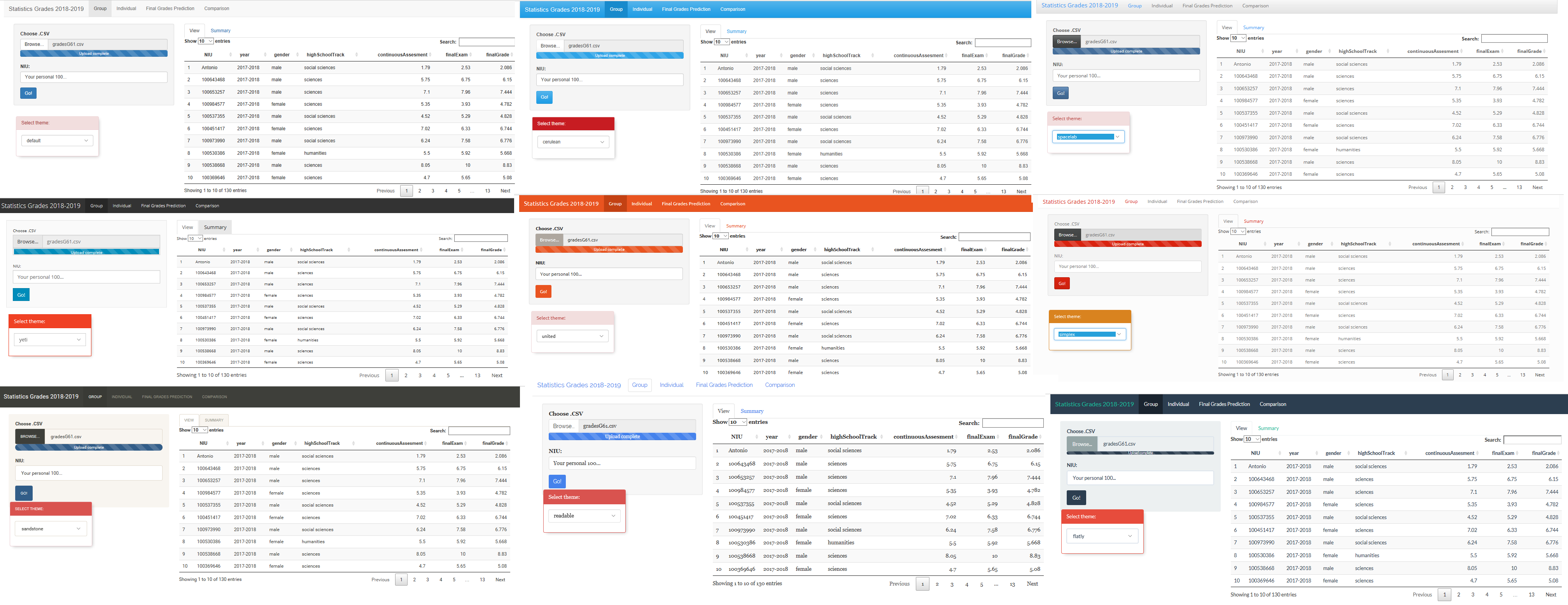
But even without knowledge of web site programming, there are R functions for these purposes. An example is to include a theme in our App that includes automatically a Cascading Style Sheet with predefined options. Run the code below for running a widget (JS) that allows to visualize our App with different themes.
fluidPage(
  shinythemes::themeSelector(),
  navbarPage(
    # theme = "cerulean",  # <--- To use a theme, uncomment this
    "Statistics Grades 2018-2019",
    tabPanel("Group",
             sidebarPanel(
             ),
             mainPanel(
             )
    ),
    tabPanel("Individual",
             verticalLayout(
             ),
             sidebarLayout(
               sidebarPanel(
               ),
               mainPanel(
               )
             )
    ),
    tabPanel("Final Grades Prediction",
             splitLayout(
             )
    ),
    tabPanel("Comparison",
             sidebarPanel(
             ),
             mainPanel(
             )
    )
  )
)
References
The materials of this session are mainly based on Shiny Tutorial.