Abstract
In this talk, we will learn to use ggplot2, an R-package to make nice and useful visualizations. The package is based on a powerful and flexible structure (called the Grammar of Graphics). This structure will let us create simple data visualizations in a concise and simple way, and also complex visualizations with practically the same effort.
Along the talk, we will answer some questions: Why ggplot2? How does it work? Can I use it in my research?
Hence, at the end we will be able to create complex and informative plots with the ggplot2 package, and understand why the Grammar of Graphics is so powerful and flexible in practice.
Requirements
- Basic knowledge of R
- RStudio (recommendable, not mandatory)
install.packages("tidyverse")install.packages("gapminder")
Minor requirements (only for 5% of the talk), not mandatory:
install.packages("GGally")install.packages("gganimate")install.packages("gifski")(depending on the platform)
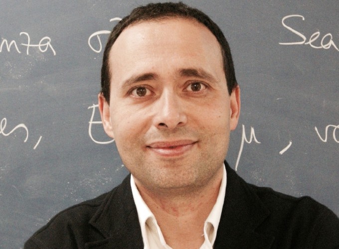
About the speaker
Associate Professor at Universidad Carlos III de Madrid (UC3M) since 2007. Senior member in the Research Institute UC3M-Santander of Financial Big Data. B.S. degree in Mathematics (1995) from Universidad Autónoma de Madrid and Ph.D. in Mathematics (2000) from UC3M. Young Investigator Award for Research Excellence (UC3M) in 2010, 2013 and 2017. Research interests in data science and optimization with applications in energy and finance.