According to CIS’ barometer, political corruption is the second biggest concern in Spain, only behind unemployment, and has been in this position since 2013, as we see Spanish news talking about open trials and new investigations on a regular basis. The European Commission estimates that corruption alone costs the EU economy 120 billion of euros per year, just a little less than the annual budget of the European Union.
Even though corruption in Spain can seem endemic, given its volume and extensity, some political leaders claim that these cases are “isolated”, not related to each other, and a thing of the past.
Data about all corruption cases in Spain can be modeled as a graph to unveil the networks of “friends” that are always charged together. We can then use Graph Theory concepts to analyze the relations and try to determine if these are indeed isolated cases. Let’s go and see what we find out!
What is a graph?
Graphs are mathematical structures that model relations between entities. The entities are called vertices, or nodes, and are represented with a circle, and the relations are called edges, or links, and are represented with lines drawn from one circle to another.
Some relations between entities might be stronger than others. That is modeled by assigning weights to the edges of the graph, which are usually represented by using different line widths.
Below we can see an example of a graph with 6 nodes and 7 edges:

In our case, we are going to build two different graphs:
Graph of people accused: with the people involved in the cases as nodes. Two people are related if they have been accused in the same case. The weight of the edges is the number of cases they share.
Graph of cases: with the corruption cases as nodes. Two cases are related if they share a person that has been accused in both. The weight of the edges is the number of people the cases have in common.
Getting the data
Now, to build these graphs we need data of all the political corruption cases in Spain, and which people are involved in them. We can get that from Casos Aislados, a web page that is doing the work of collecting all this information from news and official court documents, and releasing it to the public.
To avoid saturating the webpage with requests, I have already downloaded and processed the data, resulting in three files that we’ll use to build the graphs.
- The list of cases and people accused in each of them can be found here.
- The file of relations within people accused can be found here.
- The file of relations within corruption cases can be found here.
We can load them into R by executing the following:
list_accused_in_cases <- read.csv("cases_and_accused.csv", colClasses="character", fileEncoding="UTF-8")
relations_accused <- read.csv("relations_accused.csv", fileEncoding="UTF-8")
relations_cases <- read.csv("relations_cases.csv", fileEncoding="UTF-8")
The igraph package
Once we have the data loaded into R, it’s time to create the graphs and start working with them. For that, we’ll use a package called igraph, which is the most popular package in R for working with graphs.
If you don’t have it already, you can install the package with
install.packages("igraph")and then load the library typing
library(igraph)We can now create the graphs from our dataframes as follows:
# Graph of people accused
g_accused <- graph_from_data_frame(relations_accused[, c("accused_1", "accused_2")],
                                   directed=FALSE, vertices=unique(list_accused_in_cases$accused))
E(g_accused)$weight <- relations_accused$cases_in_common


# Graph of corruption cases
g_cases <- graph_from_data_frame(relations_cases[c("case_1", "case_2")],
                                 directed=FALSE, vertices=unique(list_accused_in_cases$case))
E(g_cases)$weight <- relations_cases$accused_in_common
Note that the function E(graph) retrieves the edges of a graph. We can use that to set edge attributes.
We have two ways of getting an overview of what the graph looks like.
The first one is using the summary() function, where we see that the graph of accused people has 3100 nodes, 31375 edges, a name attribute for the nodes, and a weight attribute for the edges.
summary(g_accused)## IGRAPH c8e74b7 UNW- 3100 31375 --
## + attr: name (v/c), weight (e/n)The second way is plotting the graph to see its shape:
plot(g_cases, vertex.label=NA, vertex.size=2, vertex.color="#0CCF02")
Connected Components
We can see that the cases graph is composed of many single dots. Those are, indeed, isolated cases: corruption cases whose people involved haven’t been accused in any other case. But we can also appreciate some structures that are formed with interconnected nodes. Each of those structures is called a connected component in Graph Theory. Isolated nodes are also connected components themselves, with size 1.
With igraph we can calculate the connected components of a graph and check their sizes:
components_cases <- components(g_cases)
components_cases_sizes <- sizes(components_cases)
If we have a look at the sizes, we can see that there are 40 connected components with more than one node. All those components are not isolated corruption cases, but corruption plots. Let’s explore them further.
Induced Subgraphs
If we want to focus on the corruption plots, we’ll need to create a new graph that only contains the cases that are involved in them. In Graph Theory, a subset of a graph created by selecting specific nodes and the edges that join them is called an induced subgraph.
Of course, igraph has a function for this. First we need to get the names of the nodes that are part of a complex component, and then we can use those names to subset the graph with induced_subgraph():
components_plots <- which(components_cases_sizes > 1)

g_cases_plots <- induced_subgraph(g_cases, vids = which(membership(components_cases) %in% components_plots))

summary(g_cases_plots)
## IGRAPH ca24e1a UNW- 235 778 --
## + attr: name (v/c), weight (e/n)The next step is getting the induced subgraph of the people that have been accused in cases that belong to a corruption plot, this is, the cases we have just selected:
accused_plots <- subset(list_accused_in_cases, case %in% V(g_cases_plots)$name)

g_accused_plots <- induced_subgraph(g_accused, vids = accused_plots$accused)

summary(g_accused_plots)
## IGRAPH ca2e7e8 UNW- 1836 23527 --
## + attr: name (v/c), weight (e/n)As a result we see now that there are 235 corruption cases that are part of any of those 40 plots we had in total, and there are 1836 people involved in at least one of them, out of the 3100 we originally had.
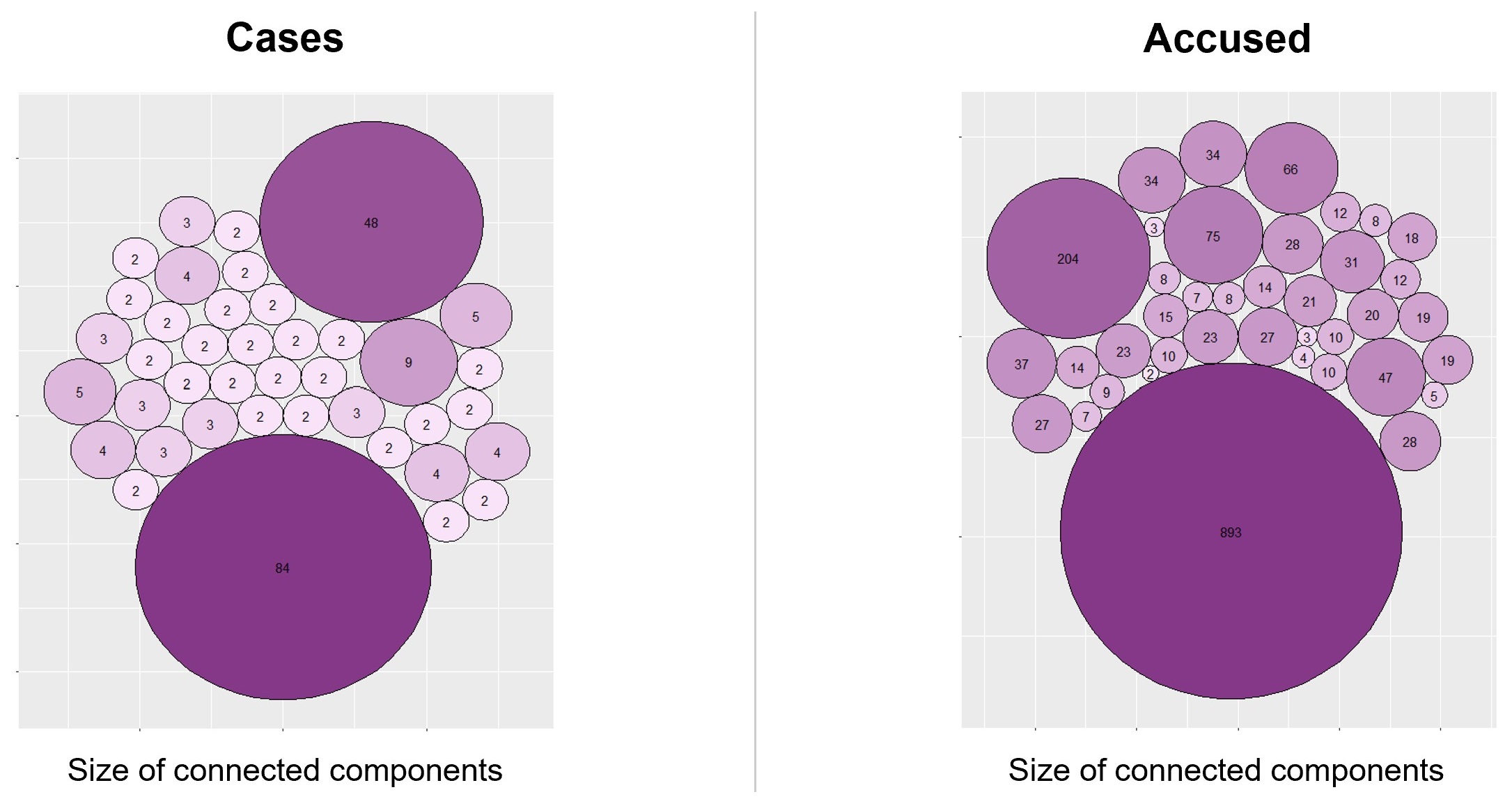
And what exactly is the size of each connected component? We can see that in the picture below:
 Take a moment and try to guess which cases correspond to the biggest corruption plots that appear in the image, you have probably heard about most of them.
- In the first place, with 84 cases and 893 people involved, we have a plot located mainly in Madrid, Valencia and Baleares and corresponding to the cases: Gürtel, Púnica, Lezo, Noos, Bárcenas, Bankia, Tarjetas Black, …
- In the second place, with 48 cases and 204 people involved, we have a plot located purely in Andalucía, comprising the ERE cases, Facturas Falsas, Cursos Formación, etc.
- In the third place we have a much smaller plot with 9 cases and 75 people involved, located mainly in Galicia and with the primary case being the Pokemon case.
The biggest component of a graph is called the giant component. We will now focus on this one, the biggest corruption plot, to learn a few more concepts of Graph Theory and Social Network Analysis.
biggest_plot <- which.max(components_cases_sizes)
g_cases_plot1 <- induced_subgraph(g_cases, vids = which(membership(components_cases) == biggest_plot))

accused_plot1 <- subset(list_accused_in_cases, case %in% V(g_cases_plot1)$name)
g_accused_plot1 <- induced_subgraph(g_accused, vids = accused_plot1$accused)
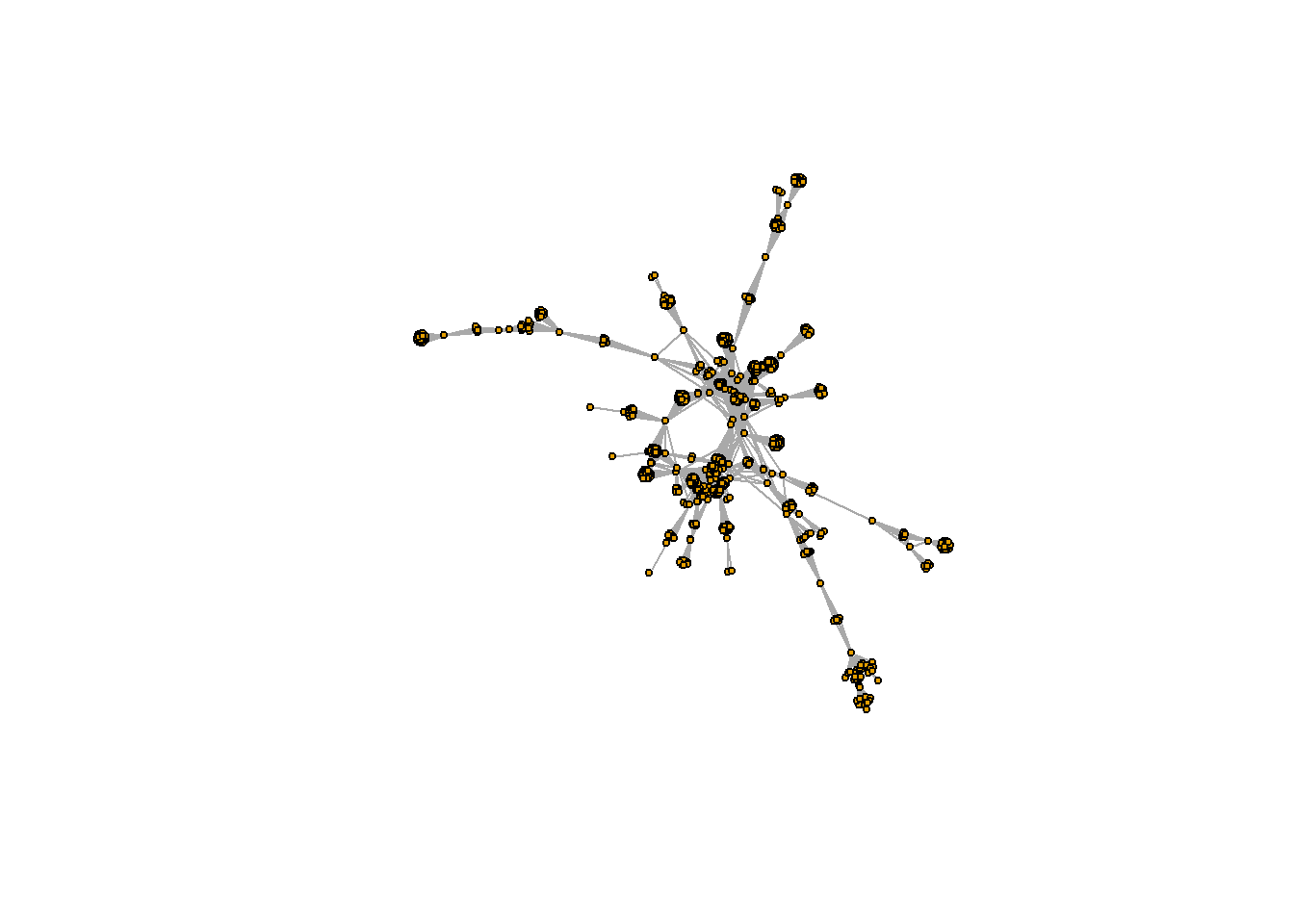
Since we are going to be plotting the same graph repeatedly, it’s a good practice to calculate the layout beforehand, and then passing it to the plot function. That way, our graph will always have the same shape, and we will save computing time.
layout_accused_plot1 <- layout_nicely(g_accused_plot1)
plot(g_accused_plot1, layout=layout_accused_plot1, vertex.label=NA, vertex.size=3)
Shortest Paths
Another important concept regarding graph topology is shortest paths.
We can think of the graph of accused people as a network of contacts, and wonder how many calls someone has to make if they want to get in contact with another person of the graph, asking for new telephone numbers until they get the one they want. Of course, this person would choose the sequence that minimizes the number of calls to make, so the path followed would be the shortest path between the two people.
Shortest paths can be different if the edges of the graph are weighted: the person looking for the phone might prefer to call the closest friend in each step, even though that implies making a bigger number of calls.
The function have to use in igraph is shortest_paths(). Let’s calculate for example the shortest path between Gallardón and Bárcenas:
path <- shortest_paths(g_accused_plot1,
                       from="Alberto Ruiz-Gallardón Jiménez",
                       to="Luis Francisco Bárcenas Gutiérrez")
path$vpath
## [[1]]
## + 4/893 vertices, named, from ca37cd5:
## [1] Alberto Ruiz-Gallardón Jiménez Ignacio González González
## [3] Alberto López Viejo Luis Francisco Bárcenas GutiérrezThe shortest sequence would be: Gallardón → Ignacio González → Alberto López Viejo → Bárcenas, with a length of 3 steps.
If we just need to know the distance, and not the details about the steps, we can use the function distance(), which takes less time to execute:
distances(g_accused_plot1,
          v="Alberto Ruiz-Gallardón Jiménez",
          to="Luis Francisco Bárcenas Gutiérrez")
## Luis Francisco Bárcenas Gutiérrez
## Alberto Ruiz-Gallardón Jiménez 3Besides calculating the length of the shortest path between a specific pair of nodes, with the distance() function we can also calculate the length of the shortest path between every pair of nodes in the graph, getting a distance matrix:
paths_lengths <- distances(g_accused_plot1)

mean(paths_lengths)
## [1] 4.29711If we then calculate the mean value of these distances, we’ll see that, on average, every two nodes of the graph are separated by 4 or 5 steps. The networks where most nodes can be reached from every other node by a small number of steps are called small-world networks. Many real-life networks have this property.
Centrality Measures
Another interesting thing we can do with graphs is trying to determine which nodes are the most relevant in the network. We don’t have an official definition for that, but there are several ways of measuring the centrality of a node in a graph that we can use:
Degree centrality: given by the degree of the node in the graph, this is, the number of edges that are connected to the node. In our people network, we could use this metric to define relevance as a function of the number of contacts of a node.
Betweenness: given by the number of shortest paths in the graph that pass through that node. This can be seen as a measure of how essential the node is to the graph.
Centrality: given by the length of the shortest paths from the node to every other node in the graph. With this metric, relevance would mean being well connected, with a short distance to everybody in the graph.
We can calculate all this metrics using igraph as follows:
nodes_degree <- degree(g_accused_plot1)

nodes_betweenness <- betweenness(g_accused_plot1)

nodes_closeness <- closeness(g_accused_plot1)
Community Extraction
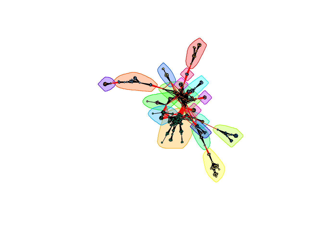
Finally, the last thing we are going to analyze is the groups of people that are more connected, the groups of “friends” in the graph. These groups or clusters are called communities in Graph Theory.
There are many different algorithms for calculating communities, and each of them can result in a different division. A lot of them are implemented in igraph, with functions starting with cluster_. In this case, we are going to calculate the groups of friends with an algorithm called Walktrap, which is based on random walks through the graph. We can play with different numbers of steps until we like the groups we get.
comm_accused_plot1 <- cluster_walktrap(g_accused_plot1, steps=50)The goodness of a division in communities can be measured with something called modularity, which determines how well separated the clusters are from each other.
modularity(comm_accused_plot1)## [1] 0.8216408Modularity takes values from -1 to 1, with a value close to 1 indicating a strong community structure. Therefore, we can see that the division we have achieved is pretty good.
And how does that division look like? We can plot the graph together with the community structure using an enhanced version of the plot() function that accepts the community object and the graph object as parameters:
plot(comm_accused_plot1, g_accused_plot1,
     layout=layout_accused_plot1,
     vertex.label=NA, vertex.size=3)