Introduction
A time series is a sequence of observations registered at consecutive time instants. The visualization of time series is intended to reveal changes of one or more quantitative variables through time, and to display the relationships between the variables and their evolution through time. The standard time series graph displays the time along the horizontal axis. On the other hand, time can be conceived as a grouping or conditioning variable. This solution allows several variables to be displayed together with a scatterplot, using different panels for subsets of the data (time as a conditioning variable) or using different attributes for groups of the data (time as a grouping variable). Finally, time can be used as a complementary variable that adds information to a graph where several variables are confronted.
Next sections provide a variety of examples to illustrate a set of
useful techniques working with three datasets available at the data
folder of the repository.
This document has been prepared with content extracted and adapted from the second edition of the book “Displaying time series, spatial and space-time data with R” published with Chapman&Hall/CRC.
The most relevant packages are: lattice, latticeExtra, and
ggplot2 for static graphics; zoo and xts for reading and
arranging data as time series; RColorBrewer for defining color
palettes; and packages dygraphs, highcharter, and plotly, based
on the htmlwidgets framework, to generate animations or interactive
graphics.
Let’s begin loading the main packages and setting some graphical
parameters of lattice and latticeExtra.
library(lattice)
library(ggplot2)
# latticeExtra must be loaded after ggplot2 to prevent masking of `layer`
library(latticeExtra)
library(RColorBrewer)
# lattice and latticeExtra configuration
myTheme <- custom.theme.2(
  pch=19, cex=0.7, region=rev(brewer.pal(9, 'YlOrRd')),
  symbol=brewer.pal(n=8, name="Dark2"))
myTheme$strip.background$col = myTheme$strip.shingle$col =
  myTheme$strip.border$col = 'transparent'

myArgs <- list(
  as.table=TRUE, between=list(x=0.5, y=0.2),
  xscale.components = function(...)
    modifyList(xscale.components.default(...), list(top=FALSE)),
  yscale.components = function(...)
    modifyList(yscale.components.default(...), list(right=FALSE)))

lattice.options(default.theme=myTheme, default.args=modifyList(
  lattice.options()$default.args, myArgs))

library(zoo)
And this is the data we will use:
load('aranjuez.RData')
load('navarra.RData')
load('CO2.RData')
Time on the horizontal axis
The most frequent visualization method of a time series uses the horizontal axis to depict the time index. This section illustrates two variants of this approach to display multivariate time series: multiple time series with different scales, and variables with the same scale.
Time graph of variables with different scales
There is a variety of scientific research interested in the relationship among several meteorological variables. A suitable approach is to display the time evolution of all of them using a panel for each of the variables. The superposition of variables with different characteristics is not very useful (unless their values were previously rescaled), so this approach is postponed for the next section (variables with the same scale).
For the first example we will use the eight years of daily data from
a meteorological station located at Aranjuez (Madrid).
This multivariate time series can be displayed with the xyplot
method of lattice for zoo objects with a panel for each variable.
## The layout argument arranges panels in rows
xyplot(aranjuez, layout = c(1, ncol(aranjuez))) 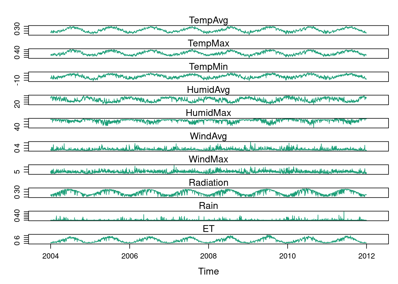
The package ggplot2 provides the generic method autoplot to
automate the display of certain classes with a simple command. The
package zoo provides an autoplot method for the zoo class with
a result similar to that obtained with xyplot.
## facet_free allows each panel to have its own range
autoplot(aranjuez) + facet_free() 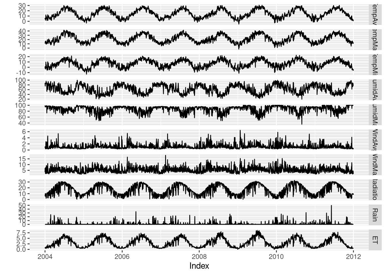
Time series of variables with the same scale
As an example of time series of variables with the same scale, we will use measurements of solar radiation from different meteorological stations.
The first attempt to display this multivariate time series makes use
of the xyplot.zoo method. The objective of this graphic is to
display the behavior of the collection as a whole: the series are
superposed in the same panel (superpose=TRUE) without legend
(auto.key=FALSE), using thin lines and partial
transparency. Transparefncy softens overplotting problems and reveals
density clusters because regions with more overlapping lines are
darker. Next code displays the variations around the time average
(avRad).
avRad <- zoo(rowMeans(navarra, na.rm = 1), index(navarra))
pNavarra <- xyplot(navarra - avRad,
        superpose = TRUE, auto.key = FALSE,
        lwd = 0.5, alpha = 0.3, col = 'midnightblue')
pNavarra 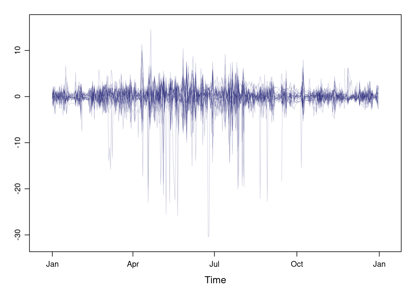
This result can be improved with the horizon graph. The horizon graph is useful in examining how a large number of series changes over time, and does so in a way that allows both comparisons between the individual time series and independent analysis of each series. Moreover, extraordinary behaviors and predominant patterns are easily distinguished.
This graph displays several stacked series collapsing the y-axis to free vertical space:
- Positive and negative values share the same vertical space. Negative values are inverted and placed above the reference line. Sign is encoded using different hues (positive values in blue and negative values in red).
- Differences in magnitude are displayed as differences in color intensity (darker colors for greater differences).
- The color bands share the same baseline and are superposed, with darker bands in front of the lighter ones.
Because the panels share the same design structure, once this technique is understood, it is easy to establish comparisons or spot extraordinary events. This method is what Tufte described as small multiples.
Next code displays the variations of solar radiation around the time
average with a horizon graph using a row for each time series. In the
code we choose origin=0 and leave the argument horizonscale
undefined (default). With this combination each panel has different
scales and the colors in each panel represent deviations from the
origin. This is depicted in the color key with the \(\Delta_i\) symbol,
where the subscript i denotes the existence of multiple panels with
different scales.
horizonplot(navarra - avRad,
            layout = c(1, ncol(navarra)),
            origin = 0, ## Deviations in each panel are calculated
                        ## from this value
            colorkey = TRUE,
col.regions = brewer.pal(6, "RdBu")) 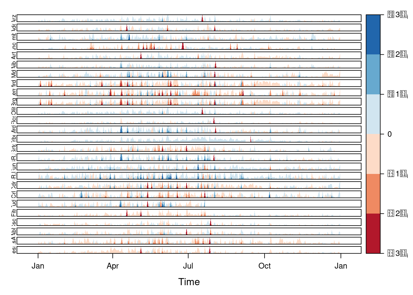
The horizon graph is also useful in revealing the differences between
a univariate time series and another reference. For example, we might
be interested in the departure of the observed temperature from the
long-term average, or in other words, the temperature change over
time. Let’s illustrate this approach with the time series of daily
average temperatures measured at the meteorological station of
Aranjuez. The reference is the long-term daily average calculated with
ave.
Ta <- aranjuez$TempAvg
timeIndex <- index(aranjuez)
longTa <- ave(Ta, format(timeIndex, '%j'))
diffTa <- (Ta - longTa)
The next code uses horizonplot with the cut-and-stack method to distinguish between years.
years <- unique(format(timeIndex, '%Y'))

horizonplot(diffTa, cut = list(n = 8, overlap = 0),
            colorkey = TRUE, layout = c(1, 8),
            scales = list(draw = FALSE, y = list(relation = 'same')),
            origin = 0, strip.left = FALSE) +
    layer(grid.text(years[panel.number()], x  =  0, y  =  0.1,
                    gp = gpar(cex = 0.8),
just = "left")) 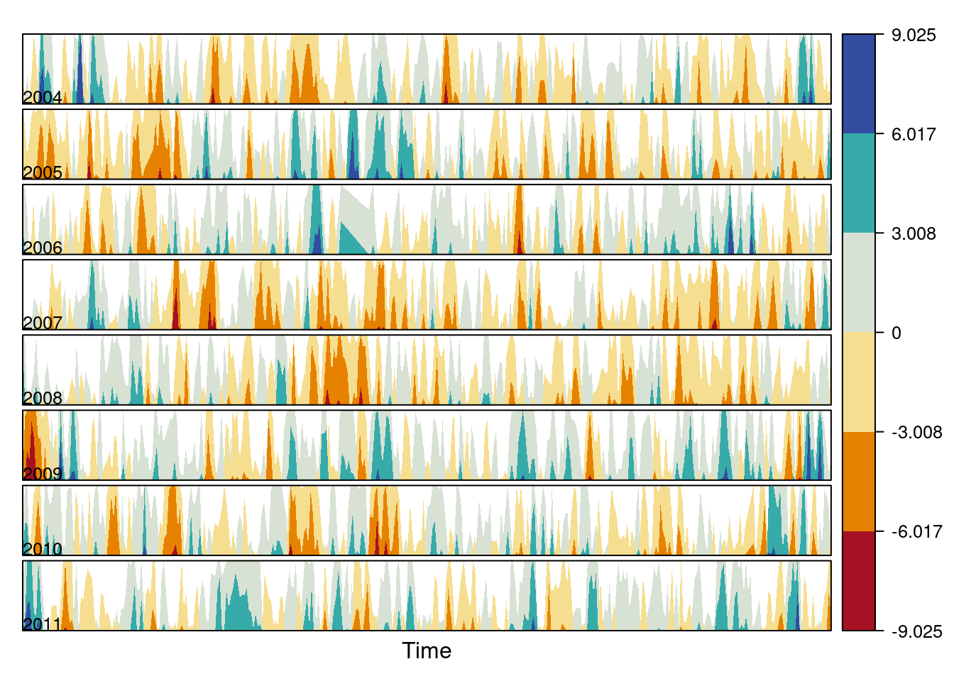
An alternative is a level plot displaying the time series using parts of its time index both as independent and as conditioning variable. The following code displays the differences with the day of the month on the horizontal axis and the year on the vertical axis, with a different panel for each month number. Therefore, each cell of the next figure corresponds to a certain day of the time series.
year <- function(x)as.numeric(format(x, '%Y'))
day <- function(x)as.numeric(format(x, '%d'))
month <- function(x)as.numeric(format(x, '%m'))
myTheme <- modifyList(custom.theme(region = brewer.pal(9, 'RdBu')),
list(
strip.background = list(col = 'gray'),
panel.background = list(col = 'gray')))
maxZ <- max(abs(diffTa))
levelplot(diffTa ~ day(timeIndex) * year(timeIndex) | factor(month(timeIndex)),
at = pretty(c(-maxZ, maxZ), n = 8),
colorkey = list(height = 0.3),
layout = c(1, 12), strip = FALSE, strip.left = TRUE,
xlab = 'Day', ylab = 'Month',
par.settings = myTheme)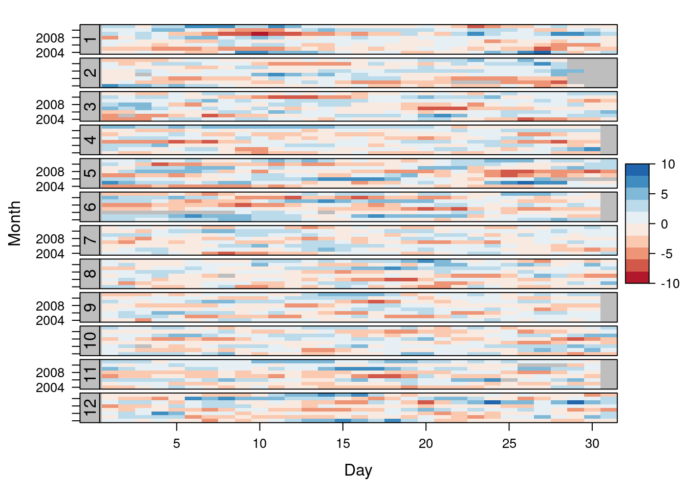
The ggplot version requires a data.frame with the day, year, and month arranged in different columns.
df <- data.frame(Vals = diffTa,
                 Day = day(timeIndex),
                 Year = year(timeIndex),
                 Month = month(timeIndex))
The values (Vals column of this data.frame) are displayed as a level plot thanks to the geom_raster function.
library(scales)
## The packages scales is needed for the pretty_breaks function.

ggplot(data = df,
       aes(fill = Vals,
           x = Day,
           y = Year)) +
    facet_wrap(~ Month, ncol = 1, strip.position = 'left') +
    scale_y_continuous(breaks = pretty_breaks()) +
    scale_fill_distiller(palette = 'RdBu', direction = 1) +
    geom_raster() +
    theme(panel.grid.major = element_blank(),
panel.grid.minor = element_blank()) 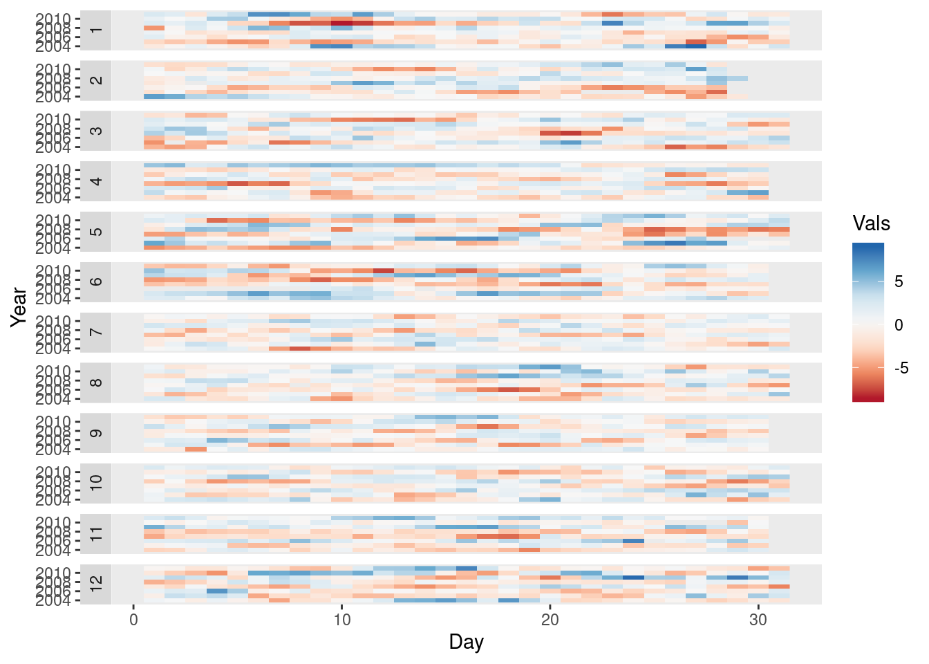
Interactive graphics
This section describes the interactive alternatives of the static
figures included in the previous sections with several packages:
dygraphs, highcharter, and plotly. These packages
are R interfaces to JavaScript libraries based on the htmlwidgets
package.
Dygraphs
The dygraphs package is an interface to the dygraphs JavaScript
library, and provides facilities for charting time-series. It works
automatically with xts time series objects, or with objects than can
be coerced to this class. The result is an interactive graph, where
values are displayed according to the mouse position over the time
series. Regions can be selected to zoom into a time period.
library(dygraphs)

dyTemp <- dygraph(aranjuez[, c("TempMin", "TempAvg", "TempMax")],
       main = "Temperature in Aranjuez",
       ylab = "ºC")

widgetframe::frameWidget(dyTemp)
You can customize dygraphs by piping additional commands onto the
original graphic. The function dyOptions provides several choices
for the graphic, and the function dyHighlight configures options for
data series mouse-over highlighting. For example, with the next code
the semi-transparency value of the non-selected lines is reduced and
the width of the selected line is increased.
dyTemp %>%
  dyHighlight(highlightSeriesBackgroundAlpha = 0.2,
    highlightSeriesOpts = list(strokeWidth = 2)) %>%
  widgetframe::frameWidget()
An alternative approach to depict the upper and lower variables of
this time series is with a shaded region. The dySeries function
accepts a character vector of length 3 that specifies a set of input
column names to use as the lower, value, and upper for a series with a
shaded region around it.
dygraph(aranjuez[, c("TempMin", "TempAvg", "TempMax")],
 main = "Temperature in Aranjuez",
 ylab = "ºC") %>%
   dySeries(c("TempMin", "TempAvg", "TempMax"),
      label = "Temperature") %>%
  widgetframe::frameWidget()
Highcharter
The highcharter package is an interface to the highcharts
JavaScript library, with a wide spectrum of graphics
solutions. Displaying time series with this package can be achieved
with the combination of the generic highchart function and several
calls to the hc_add_series_xts function through the pipe %>%
operator. Once again, the result is an interactive graph with
selection and zoom capabilities.
library(highcharter)
library(xts)

aranjuezXTS <- as.xts(aranjuez)

highchart() %>%
   hc_add_series(name = 'TempMax',
           aranjuezXTS[, "TempMax"]) %>%
   hc_add_series(name = 'TempMin',
           aranjuezXTS[, "TempMin"]) %>%
   hc_add_series(name = 'TempAvg',
           aranjuezXTS[, "TempAvg"]) %>%
  widgetframe::frameWidget()
plotly
The plotly package is an interface to the plotly JavaScript
library, also with a wide spectrum of graphics solutions. This package
does not provide any function specifically focused on time
series. Thus, the time series object has to be transformed into a
data.frame including a column for the time index. If the
data.frame is in wide format (one column per variable), each
variable will be represented with a call to the add_lines
function. However, if the data.frame is in long format (a column
for values, and a column for variable names) only one call to
add_lines is required. The next code follows this approach using the
combination of fortify, to convert the zoo object into a
data.frame, and melt, to transform from wide to long format.
aranjuezDF <- fortify(aranjuez[,
            c("TempMax",
              "TempAvg",
              "TempMin")],
           melt = TRUE)

summary(aranjuezDF)
## Index Series Value
## Min. :2004-01-01 TempMax:2898 Min. :-12.980
## 1st Qu.:2005-12-29 TempAvg:2898 1st Qu.: 7.107
## Median :2008-01-09 TempMin:2898 Median : 13.560
## Mean :2008-01-03 Mean : 14.617
## 3rd Qu.:2010-01-03 3rd Qu.: 21.670
## Max. :2011-12-31 Max. : 41.910
## NA's :10Next code produces an interactive graphic with the generic function
plot_ly connected with add_lines through the pipe operator,
%>%.
library(plotly)

plot_ly(aranjuezDF) %>%
   add_lines(x = ~ Index,
       y = ~ Value,
       color = ~ Series) %>%
  widgetframe::frameWidget()
Time as a conditioning or grouping variable
Previously we learned to display the time evolution of multiple time series with different scales. But, what if instead of displaying the time evolution we want to represent the relation between the variables? This section follows this approach: first, a scatterplot matrix using groups is defined according to the time as a grouping variable; next, an enhanced scatterplot with time as a conditioning variable is produced using the small multiples technique.
Scatterplot matrix: time as a grouping variable
The scatterplot matrices are based on the technique of small multiples: small, thumbnail-sized representations of multiple images displayed all at once, which allows the reader to immediately, and in parallel, compare the inter-frame differences. A scatterplot matrix is a display of all pairwise bivariate scatterplots arranged in a \(p \times p\) matrix for \(p\) variables. Each subplot shows the relation between the pair of variables at the intersection of the row and column indicated by the variable names in the diagonal panels.
This graphical tool is implemented in the splom function. The
following code displays the relation between the set of
meteorological variables using a sequential palette from the
ColorBrewer catalog (RbBu, with black added to complete a
twelve-color palette) to encode the month. The order of colors of
this palette is chosen in order to display summer months with
intense colors and to distinguish between the first and second
half of the year with red and blue, respectively.
aranjuezDF <- as.data.frame(aranjuez)
aranjuezDF$Month <- format(index(aranjuez), '%m')
## Red-Blue palette with black added (12 colors)
colors <- c(brewer.pal(n = 11, 'RdBu'), '#000000')
## Rearrange according to months (darkest for summer)
colors <- colors[c(6:1, 12:7)] splom(~ aranjuezDF[1:10], ## Do not include "Month"
groups = aranjuezDF$Month,
auto.key = list(space = 'right',
title = 'Month', cex.title = 1),
pscale = 0, varname.cex = 0.7, xlab = '',
par.settings = custom.theme(symbol = colors,
pch = 19),
cex = 0.3, alpha = 0.1)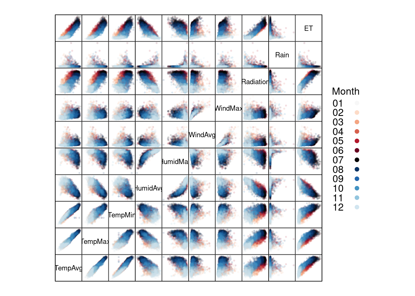
The ggplot2 version of this graphic is produced thanks to the
ggpairs function provided by the GGally package.
library(GGally)

ggpairs(aranjuezDF,
 columns = 1:10, ## Do not include "Month"
 upper = list(continuous = "points"),
mapping = aes(colour = Month, alpha = 0.1)) 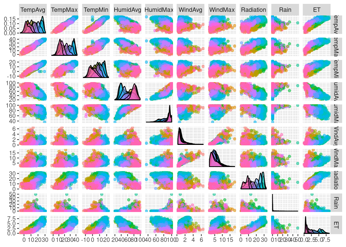
Scatterplot with time as a conditioning variable
Previous graphics use colors to encode months. Instead, we will now display separate scatterplots with a panel for each month. In addition, the statistic type (average, maximum, minimum) is included as an additional conditioning variable.
First, the dataset must be reshaped from the wide format
(one column for each variable) to the long format (only one column for
the temperature values with one row for each observation). This task
is easily accomplished with the melt function included in the
reshape2 package.
library(reshape2)

aranjuezRshp <- melt(aranjuezDF,
                     measure.vars = c('TempMax',
                                      'TempAvg',
                                      'TempMin'),
                     variable.name = 'Statistic',
                     value.name = 'Temperature')
This matrix of panels can be displayed with ggplot using
facet_grid. Next code uses partial transparency to cope with
overplotting, small horizontal and vertical segments (geom_rug) to
display points density on both variables, and a smooth line in each
panel.
ggplot(data = aranjuezRshp, aes(Radiation, Temperature)) +
   facet_grid(Statistic ~ Month) +
   geom_point(col = 'skyblue4', pch = 19, cex = 0.5, alpha = 0.3) +
   geom_rug() +
   stat_smooth(se = FALSE, method = 'loess',
     col = 'indianred1', lwd = 1.2) +
theme_bw() 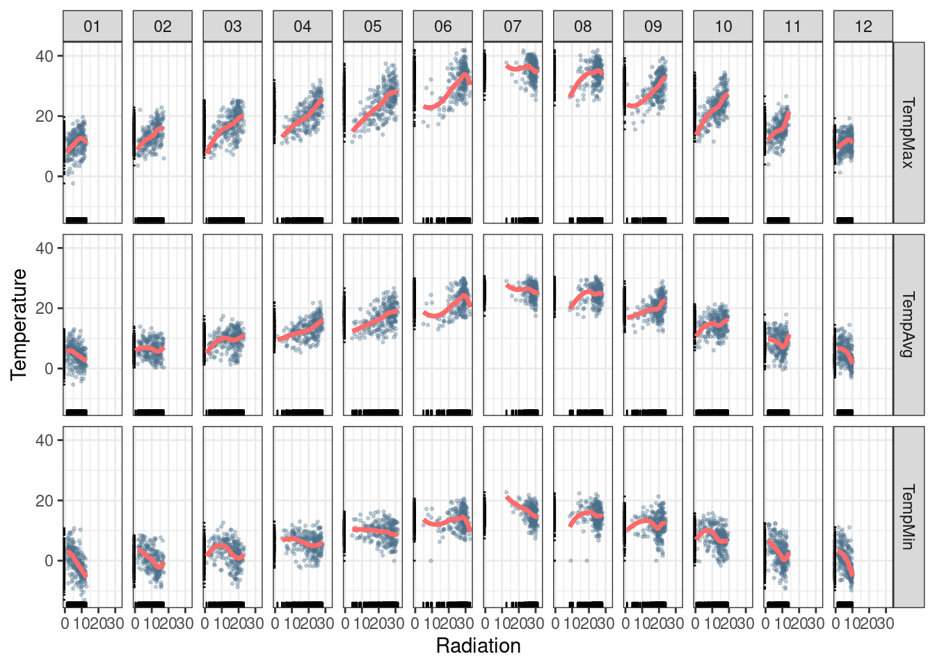
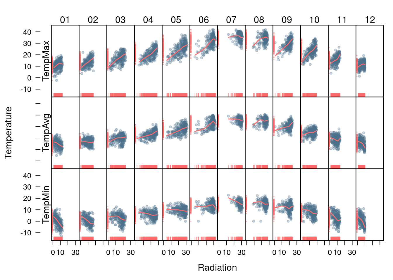
The version with lattice needs the useOuterStrips function from
the latticeExtra package, which prints the names of the conditioning
variables on the top and left outer margins.
useOuterStrips(
   xyplot(Temperature ~ Radiation | Month * Statistic,
    data = aranjuezRshp,
    between = list(x = 0),
    col = 'skyblue4', pch = 19,
    cex = 0.5, alpha = 0.3)) +
   layer({
 panel.rug(..., col.line = 'indianred1',
       end = 0.05, alpha = 0.6)
 panel.loess(..., col = 'indianred1',
         lwd = 1.5, alpha = 1)
}) 
Time as a complementary variable
In this section, time will be used as a complementary variable which adds information to a graph where several variables are confronted. We will illustrate this approach with the evolution of the relationship between Gross National Income (GNI) and carbon dioxide (\(CO_2\)) emissions for a set of countries extracted from the database of the World Bank Open Data. We will try several solutions to display the relationship between \(CO_2\) emissions and GNI over the years using time as a complementary variable.
Polylines
Our first approach is to display the entire data in a panel with a scatterplot using country names as the grouping factor. Points of each country are connected with polylines to reveal the time evolution.
## lattice version
xyplot(GNI.capita  ~ CO2.capita, data = CO2data,
xlab = "Carbon dioxide emissions (metric tons per capita)",
ylab = "GNI per capita, PPP (current international $)",
groups = Country.Name, type = 'b') 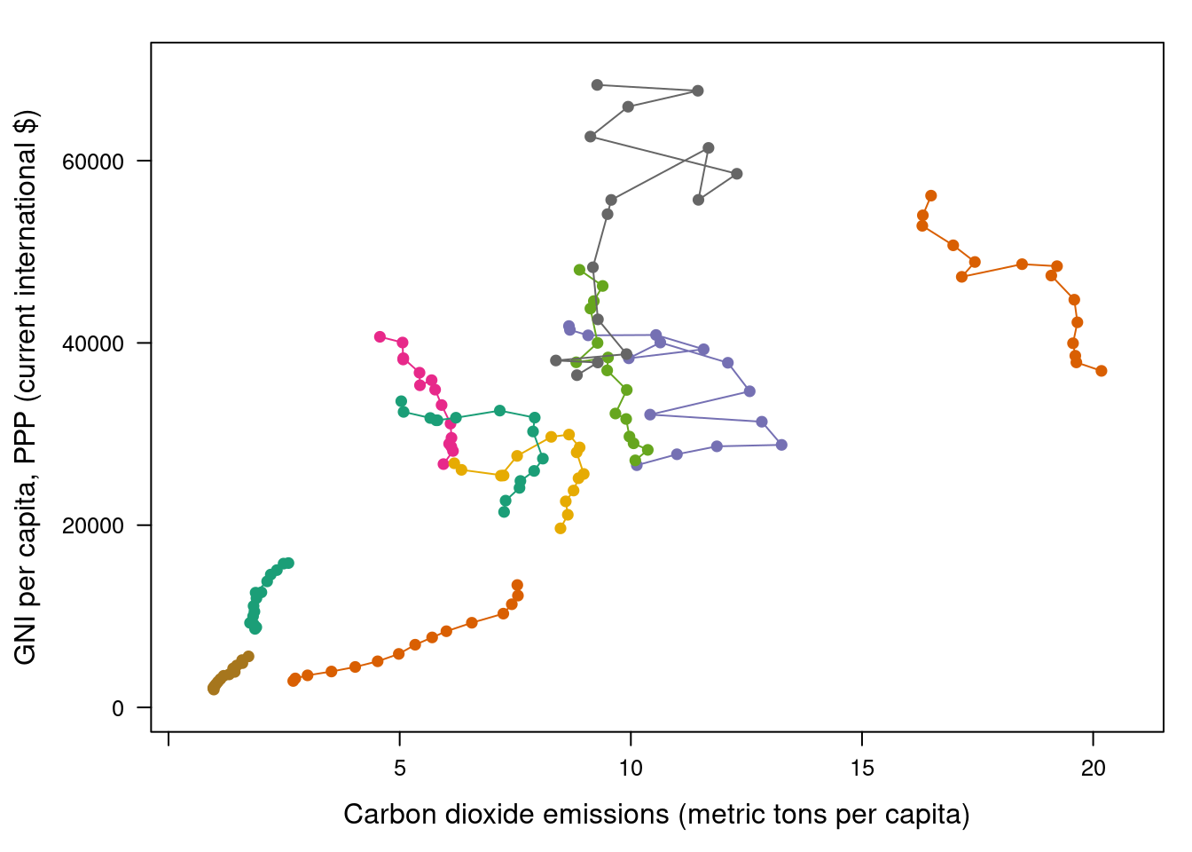
Three improvements can be added to this graphical result:
- Define a better palette to enhance visual discrimination between countries.
- Display time information with labels to show year values.
- Label each polyline with the country name instead of a legend.
Choosing colors
The Country.Name categorical variable will be encoded with a
qualitative palette, namely the first five colors of Set1 palette
from the RColorBrewer package. Because there are more countries
than colors, we have to repeat some colors to complete the number of
levels of the variable Country.Name. The result is a palette with
non-unique colors, and thus some countries will share the same
color. This is not a problem because the curves will be labeled, and
countries with the same color will be displayed at enough distance.
nCountries <- nlevels(CO2data$Country.Name)
pal <- brewer.pal(n = 5, 'Set1')
pal <- rep(pal, length = nCountries)
Adjacent colors of this palette are chosen to be easily
distinguishable. Therefore, the connection between colors and
countries must be in such a way that nearby lines are encoded with
adjacent colors of the palette. A simple approach is to calculate the
annual average of the variable to be represented along the x-axis
(CO2.capita), and extract colors from the palette according to the
order of this value.
## Rank of average values of CO2 per capita
CO2mean <- aggregate(CO2.capita ~ Country.Name,
          data = CO2data, FUN = mean)
palOrdered <- pal[rank(CO2mean$CO2.capita)]

## simpleTheme encapsulates the palette in a new theme for xyplot
myTheme <- simpleTheme(pch = 19, cex = 0.6, col = palOrdered)
## lattice version
pCO2.capita <- xyplot(GNI.capita ~ CO2.capita,
data = CO2data,
xlab = "Carbon dioxide emissions (metric tons per capita)",
ylab = "GNI per capita, PPP (current international $)",
groups = Country.Name,
par.settings = myTheme,
type = 'b')
pCO2.capita 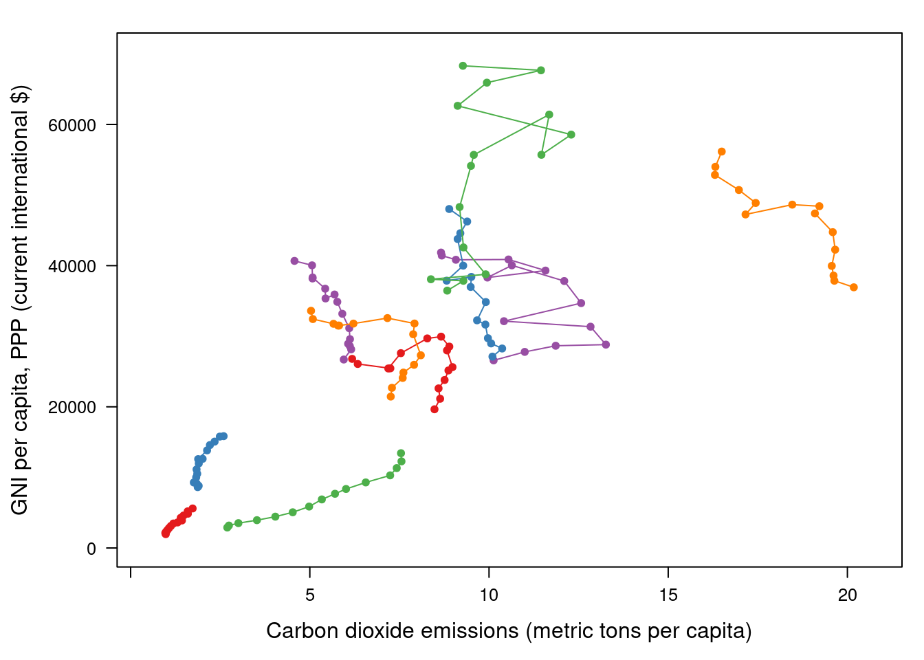
## ggplot2 version
gCO2.capita <- ggplot(data = CO2data,
           aes(x = CO2.capita,
           y = GNI.capita,
           color = Country.Name)) +
   geom_point() + geom_path() +
   scale_color_manual(values = palOrdered, guide = FALSE) +
   xlab('CO2 emissions (metric tons per capita)') +
   ylab('GNI per capita, PPP (current international $)') +
   theme_bw()
Labels to show time information
This result can be improved with labels displaying the years to show
the time evolution. The panel function panel.text prints the
year labels with the combination of +.trellis, glayer_ and
panel.text. Using glayer_ instead of glayer we ensure that the
labels are printed below the lines.
## lattice version
pCO2.capita <- pCO2.capita +
   glayer_(panel.text(...,
        labels = CO2data$Year[subscripts],
          pos = 2, cex = 0.5, col = 'gray'))
pCO2.capita 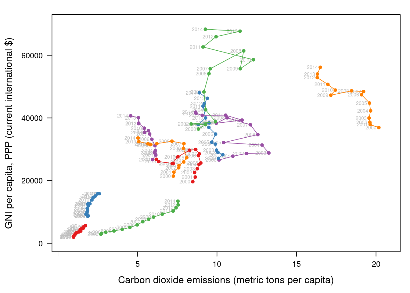
## ggplot2 version
gCO2.capita <- gCO2.capita + geom_text(aes(label = Year),
                colour = 'gray',
                size = 2.5,
                hjust = 0, vjust = 0)
Country names: positioning labels
The common solution to link each curve with the group value is to add a legend. However, a legend can be confusing with too many items. In addition, the reader must carry out a complex task: Choose the line, memorize its color, search for it in the legend, and read the country name.
A better approach is to label each line using nearby text with the
same color encoding. A suitable method is to place the labels
avoiding the overlapping between labels and lines. The package
directlabels includes a wide repertory of positioning methods to
cope with overlapping. The main function, direct.label, is able to
determine a suitable method for each plot, although the user can
choose a different method from the collection or even define a custom
method. For the pCO2.capita object, the best results are obtained
with extreme.grid.
library(directlabels)

## lattice version
direct.label(pCO2.capita,
method = 'extreme.grid') 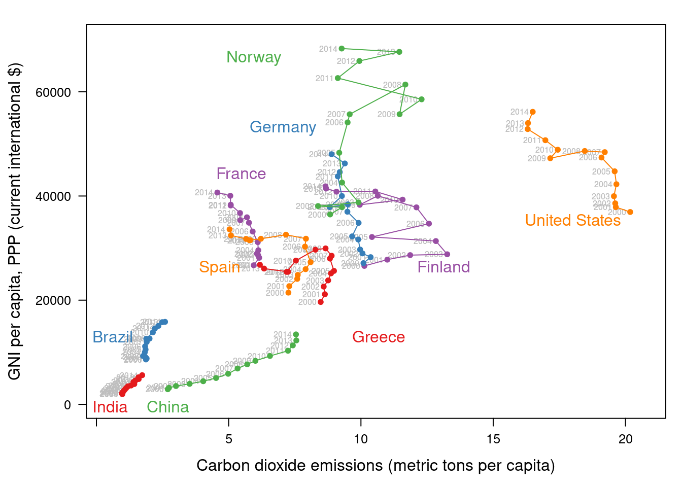
## ggplot2 version
direct.label(gCO2.capita, method = 'extreme.grid') 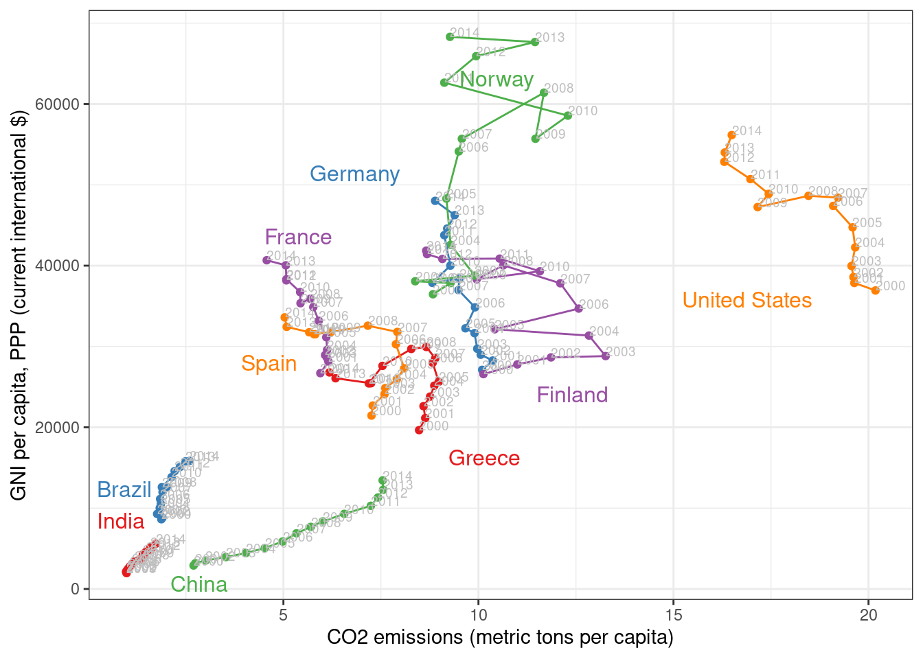
Interactive graphics: animation
This section describes how to display the data through animation with interactive functionalities with a solution that resembles the motion chart product published by Gapminder.
Gapminder is an independent foundation based in Stockholm, Sweden. Its mission is “to debunk devastating myths about the world by offering free access to a fact-based world view.” They provide free online tools, data, and videos “to better understand the changing world.” The initial development of Gapminder was the Trendalyzer software, used by Hans Rosling in several sequences of his documentary “The Joy of Stats.”
The information visualization technique used by Trendalyzer is an interactive bubble chart. By default it shows five variables: two numeric variables on the vertical and horizontal axes, bubble size and color, and a time variable that may be manipulated with a slider. The software uses brushing and linking techniques for displaying the numeric value of a highlighted country.
We will mimic the Trendalyzer/Motion Chart solution with the package
plotly, using traveling bubbles of different colors and with radius
proportional to the values of the variable CO2.PPP. Previously, you
should watch the magistral video “200 Countries, 200 Years, 4 Minutes”.
The plotly package has already been used previously to create an
interactive graphic representing time in the x-axis. In this section
this package produces an animation piping the result of the plot_ly
and add_markers functions through the animation_slider function.
Variables CO2.capita and GNI.capita are represented in the x-axis
and y-axis, respectively.
p <- plot_ly(CO2data,
      x = ~CO2.capita,
      y = ~GNI.capita,
      sizes = c(10, 100),
      marker = list(opacity = 0.7,
            sizemode = 'diameter'))
CO2.PPP is encoded with the circle sizes, while Country.Name is
represented both with colours and with labels.
p <- add_markers(p,
      size = ~CO2.PPP,
      color = ~Country.Name,
      text = ~Country.Name, hoverinfo = "text",
      ids = ~Country.Name,
      frame = ~Year,
      showlegend = FALSE)
Finally, the animation is created with animation_opts, to customize the
frame and transition times, and with animation_slider to define the
slider.
p <- animation_opts(p,
         frame = 1000,
         transition = 800,
         redraw = FALSE)

p <- animation_slider(p,
           currentvalue = list(prefix = "Year "))

widgetframe::frameWidget(p)