Displaying time series with R

Displaying time series with R
Abstract
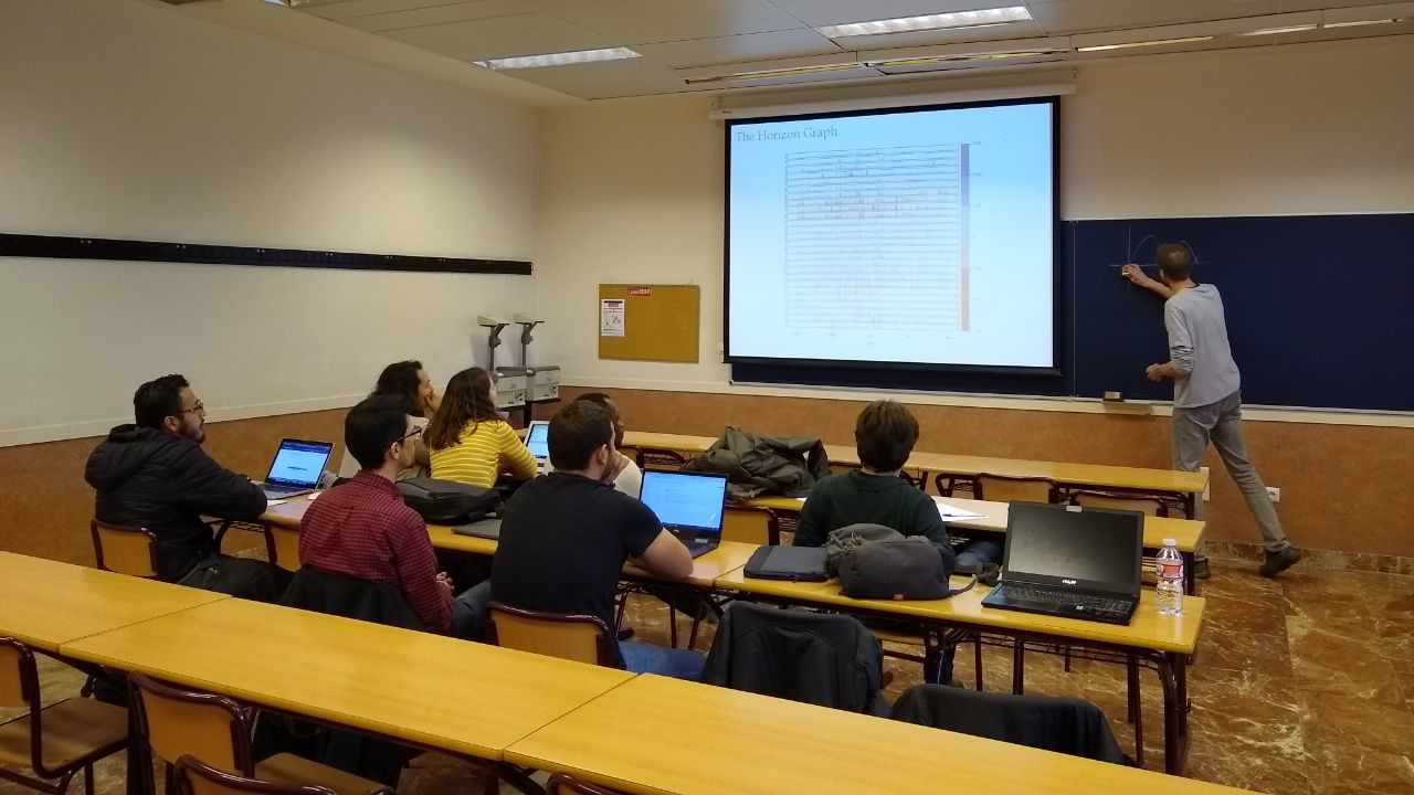
The visualization of time series is intended to reveal changes of one or more quantitative variables through time, and to display the relationships between the variables and their evolution through time. The standard time series graph displays the time along the horizontal axis. On the other hand, time can be conceived as a grouping or conditioning variable. This solution allows several variables to be displayed together with a scatterplot, using different panels for subsets of the data (time as a conditioning variable) or using different attributes for groups of the data (time as a grouping variable). Finally, time can be used as a complementary variable that adds information to a graph where several variables are confronted. This talk explores these approaches with a variety of examples and a set of useful visualization techniques.
Requirements
Required R packages:
lattice,latticeExtra, andggplot2for static graphics.zooandxtsfor reading and arranging data as time series.RColorBrewerfor defining color palettes.dygraphs,highcharter, andplotly, to generate animations and interactive graphics.
Suggested R packages (only used in certain examples):
scales,reshape2,GGally,directlabels.
About the speaker
Oscar Perpiñán-Lamigueiro is an Associate Professor at the Universidad Politécnica de Madrid, involved in teaching and research of Electrical Engineering, Electronics and Programming. He is also a lecturer of Photovoltaic and Solar Energy at the Escuela de Organización Industrial. He holds a Master’s Degree in Telecommunications Engineering and a PhD in Industrial Engineering. At present, his research focuses on solar radiation (forecasting, spatial interpolation, open data) and software development with R (packages rasterVis, solaR, meteoForecast, PVF).